![]() »
»
Had to delete the original post and reupload it, because my changes were not going through on them, minus the thumbnail on the main page.
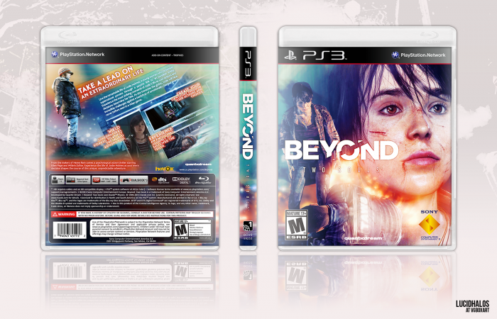
Anyway, I updated the back with suggestions made by Carlj1497, who suggested I tone down the orange box behind the headline. I did that, as well as toned down the other box at the bottom so it would not become the next issue. I think it works out better now, but I'm still open to any other suggestions.
Comments are appreciated. Thank you. :)
[ Box updated on August 21st, 2014 ] [ original ]
 Beyond: Two Souls Box Cover Comments
Comment on lucidhalos's Beyond: Two Souls Box Art / Cover.
Looks a lot better. Now the boxes blend more with the blue, just like the front. The rest is great, and I don't think there's anything that needs changing. It's definitely an interesting take on the game. Most of the other Beyond boxes I've seen are all dark and gritty, so it's nice to see something more unique for it.
[ Reply ]
Thanks a lot for your suggestions. It helped to tie things more together. I went in really wanting to use that aquagreen color, so complimentary colors tend to work best together (thus the orange). I didn't go in with the idea fully set, just tidbits I wanted to have in there so it's nice that it turned out alright.
[ Reply ]
very pretty.more cover make.
[ Reply ]
Well, this Hof was deserved, congrats!
[ Reply ]
Congrats lucid ;)
[ Reply ]
Damn, this was posted in March? Time is flying. Also, congrats!
[ Reply ]
Updated presentation and back legal bits.
[ Reply ]
Holy shit, this is beautiful. I'm stunned.
[ Reply ]
Now this is great. So much colors, it fits the different seasons of the game in a wonderful way. There is so much life in this design, it's beautiful.
[ Reply ]
hey man hate to spam up your box but could you check your inbox?
[ Reply ]
I have never seen this but man this is beautiful. Amazing job I'm seriously appalled.
[ Reply ]