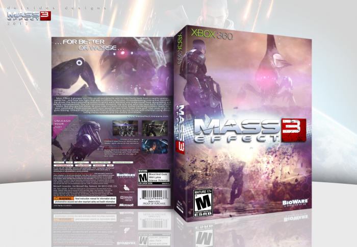
My first Midnight debut of a box :p
So I was going through all the Mass Effect covers and I notinced that there had been a lot of
very bright and lit ones and I felt bad that I had not made one for this great game :) So I
jumped in the band wagon to join in. Now I wanted the box to focus on one word "Cinematic".
That is how I wanted the cover to look and feel when I was done. Did I acheive my goal? I
think so.
Now this differs from my usual style of box making because I focused on creating scenes on
the cover, and I have only done that a couple times so far. I think this is my strongest box
so far and it was really my favorite one to have worked on. I had a blast and was excited to share.
So I hope that everyone likes this box as much as I do! And as usual, comments and favs
are more than welcome! Thank you
 Mass Effect 3 Box Cover Comments
Comment on Deividas's Mass Effect 3 Box Art / Cover.
dude this is cool! I favorited it can you check out my box too
[ Reply ]
Very nice work. I think the white around the logo is a little intense though.
[ Reply ]
I like that you've chosen to focus the entire box on a single theme, it works well and should be the way more people approach making boxarts.
[ Reply ]
tried to do something different and i think the single theme worked out :)
[ Reply ]
I'm surely loving these colors!
The right balance between an open spaced quiet scene and a hectic explosion. The 'ME3' title just pops in your face like it's used to be... and the tagline at the back is very fitting with the main title on the front (did you made the font yourself or did you just edited an original?)
I'm also glad you didn't use any grungy textures as it would be to overwhelming and not really fitting to this box, In my opinion.
b.t.w. That Robot looks straight from Resistance 3, or is it the other way around?
[ Reply ]
Thanks :) i made the tagline myself and the robot on the box is straight out of the game and not resistanc but i see what ur getting at lol
[ Reply ]
You are really catapulting yourself to the top of my favourite artists. You rarely disappoint.
[ Reply ]
thanks agent :)
[ Reply ]
Very nice, lovely colors
[ Reply ]
Nice. Like the colors and the cinematic approach you took.
[ Reply ]
thankssssss :D
[ Reply ]
So here's the ME3 box I've been hearing about lol. Looks great man
[ Reply ]
Thanks stevan :) worked my ass off on it. If the site wasnt dying, it would be doing much better so its a little sad, but what can you do :p
[ Reply ]
This looks good, there are a few things I don't particularly care for though. One would be the halftone effect on the front. While it looks alright in the bright center, I think it clashes quite a bit with the style of the artwork. Also, on the back the red text is pretty hard to see, even in full view. Still, this is a pretty good box.
[ Reply ]
I really like this one! The colors are excellent.
[ Reply ]
Nicely done, the only thing I don't like is the half-tone around the logo on the front. The back is sexy, though.
[ Reply ]