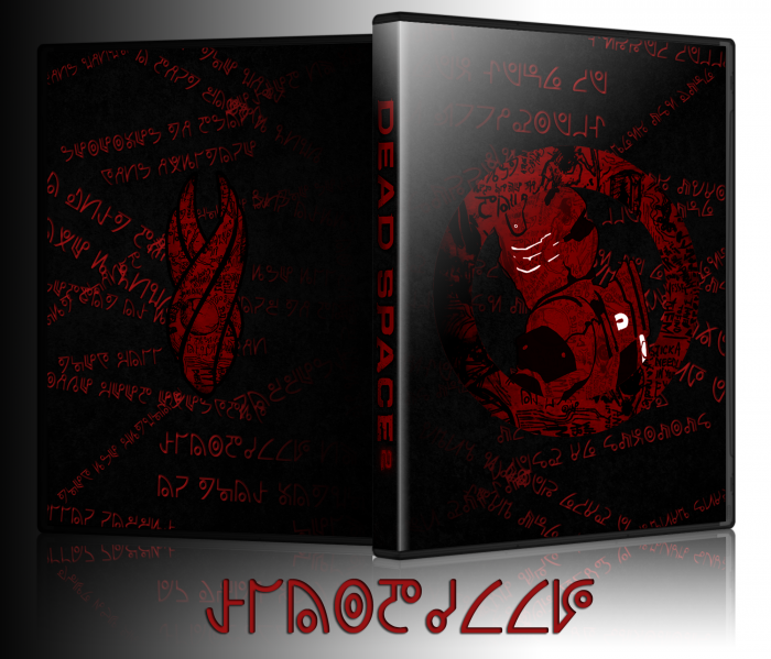
When I started this I was going to do a clean look that slowly degraded to the back. Last night, I ended up working on it for nearly 7 hours and it went in a different direction. Let me know what you think.
[ Box updated on January 26th, 2012 ] [ original ]
 Dead Space 2 Box Cover Comments
Comment on slimd1995's Dead Space 2 Box Art / Cover.

Pretty neat but this looks more like a slip cover to me then a full box.
[ Reply ]
Looks really cool but I don't think the gradient fits ~ I know you put the symbols haphazardly on purpose but still doesn't look very nice, unless you filled up more space.
[ Reply ]
Do you mean the gradients that makes the symbols transparent near the spine?
[ Reply ]
@slimd1995 Yup; also, do you know if there is different font available for the symbols? I think a more "scratch" look akin to what you have on the actual artwork would look pretty sweet. Some textures might not go amiss either but I guess that is your preference :p
[ Reply ]
@Patches I could only find one Unitology font. link
I was going to make the text a little rough looking, but after messing with some effects I was happy with how it turned out.
With the scribbles on the marker, the ring, and Isaac, texturizing the background made everything look too busy, so I left it black.
[ Reply ]
@slimd1995 I found a more organic-looking font if you're interested in using it: link
I would love at the very least to see how it looks up, even if you don't use it.
Some texture as well (again, if you even wanted to use them ~ could look like about 35% opacity and desaturated overlay): link
[ Reply ]
@Patches I love the font. I'll definitely try it out. If I like it I'll update the box tomorrow, if not I'll take a screenshot and PM it to you. Thanks for the help.
[ Reply ]
Nice! but like deiviuxs said, it does more like a slipcover than an actual box. if you'll make a new box and use this as slipcover, it would be even better imo. anyway, great work! very inspiring.
[ Reply ]
It definitely looks like something that would be made for a slip cover. I didn't want it to look like a traditional box art, which is why I left on dev logos, legal text, screenshots, etc. I considered getting rid of the Xbox 360 logos and using black plastic, but ultimately decided against it.
[ Reply ]
Real expensive pasta. Right here.
[ Reply ]
I think I like it? lol I don't know deadspace that well so I don't exactly know what's going on here.
[ Reply ]
Small update. Deleted the Xbox 360 logos and the green template. I felt that the green looked weird with all the red and block. I also added a subtle texture to the background and deleted the reflection for the marker.
[ Reply ]
excactly what I was thinking, but somehow I couldn't get my finger on it :/ it looks way better without all that green. This defenitily earns my fave now ;)
[ Reply ]
printable, please!
[ Reply ]
OTIMO JOGO RECOMENDO A TODO BRASILEIROS
[ Reply ]