#2, thanx!
#3, why do you keep saying MGS, i've seen that on other boxes you've posted on, that's the short way of saying Metal Gear Solid! But if your talking about the Microsft logo (MS) than i could go back and fix it.
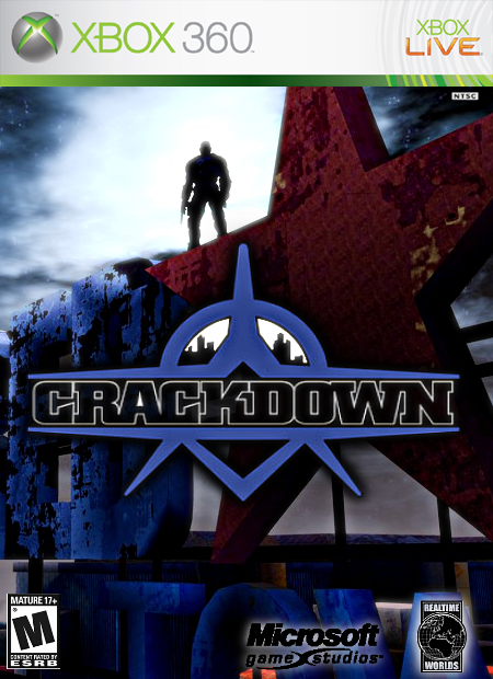
Suggestions:
1. I hate to be arrogant, but the Crackdown logo should look like the logo on my Crackdown box. :)
2. Mature logo needs to be a bit bigger.
3. Microsoft Game Studios (MGS) logo should be white.
4. I know this isn't your fault, but I really don't like the background, but I'll accept it the way it is...
I always really liked this box. But I always felt that it could be a giant chunk better. So i made this.
Using Crayon Man's template, I made a much better version of one of my personal favorite box arts. :)
#14, I just really liked this box and wanted to make it better. I don't think I will upgrade all my old boxes though. I like looking back at how bad my first boxes were. :P

 Crackdown Box Cover Comments
it looks better in full view ;)
Anyways, not much to say other than i hope you like it :)
[ Reply ]
not bad, not bad at all
[ Reply ]
yet another "why i couldnt i find that on the internet" box.
good job but the MGS logo seems big. 5/5
[ Reply ]
#2, thanx!
#3, why do you keep saying MGS, i've seen that on other boxes you've posted on, that's the short way of saying Metal Gear Solid! But if your talking about the Microsft logo (MS) than i could go back and fix it.
[ Reply ]
#4, he is, and i was wondering the same thing
[ Reply ]
I gave it a five but could you make the microsoft logo smaller thanx
[ Reply ]
oops sorry mikey im not really aware of what im doing today. and now it seems the MS logo is perfect size. im really cunfoosed now.
[ Reply ]
I went back and made the MS logo mildly smaller sinse some people wanted different things.
Enjoy...
[ Reply ]
#6, thanx :)
[ Reply ]
3.5/5
Suggestions:
1. I hate to be arrogant, but the Crackdown logo should look like the logo on my Crackdown box. :)
2. Mature logo needs to be a bit bigger.
3. Microsoft Game Studios (MGS) logo should be white.
4. I know this isn't your fault, but I really don't like the background, but I'll accept it the way it is...
[ Reply ]
i'll see if i can do anything about your suggestions. :)
[ Reply ]
i fixed a few things and also made the logo smaller so it kept it's quality. Enjoy :)
[ Reply ]
I always really liked this box. But I always felt that it could be a giant chunk better. So i made this.
Using Crayon Man's template, I made a much better version of one of my personal favorite box arts. :)
[ Reply ]
Nice upgrade . Are you going to upgrade all of your old boxarts ?
[ Reply ]
#14, I just really liked this box and wanted to make it better. I don't think I will upgrade all my old boxes though. I like looking back at how bad my first boxes were. :P
[ Reply ]
nice picture.. 4/5
[ Reply ]