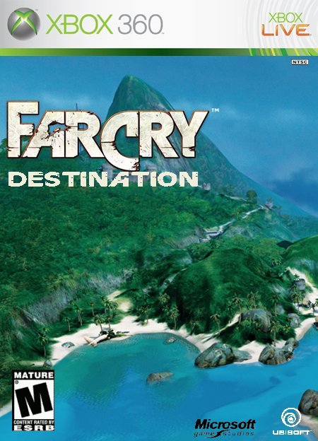
Suggestions:
1. Delete Microsoft Game Studios logo; it isn't needed.
2. Try getting a better formed Mature logo, and make it smaller.
3. Ubisoft logo should be pretty big, take reference to my Far Cry Rage box, and the word "Ubisoft" should be white.
4. Far Cry logo should be centered, and reduce its noice.
5. Give the Destination logo atleast a drop shadow or black outline; also, center it, as well.
6. Jack Carver would look good on the cover, but I know it'll probably be a hassle, but if you can try and add him somewhere on there, then do it.

 Farcry Destination Box Cover Comments
please rate and give tips not let downs thanx it took awhile so I hope you like it
[ Reply ]
My only complaint are the logos at the bottom. they all look choppy :(
but otherwise a 4/5
[ Reply ]
thanx il go backin and fixx it ok
[ Reply ]
I fixed the problem
[ Reply ]
#4, Not quite... 3/5
Suggestions:
1. Delete Microsoft Game Studios logo; it isn't needed.
2. Try getting a better formed Mature logo, and make it smaller.
3. Ubisoft logo should be pretty big, take reference to my Far Cry Rage box, and the word "Ubisoft" should be white.
4. Far Cry logo should be centered, and reduce its noice.
5. Give the Destination logo atleast a drop shadow or black outline; also, center it, as well.
6. Jack Carver would look good on the cover, but I know it'll probably be a hassle, but if you can try and add him somewhere on there, then do it.
[ Reply ]
Yeah the Destination logo does need to be a little darker and the Ubisoft logo needs fixing, but other then that, it looks terrific.
[ Reply ]
The ubisoft and Microsoft logos are way to small.
[ Reply ]