I feel that seeing both boxes is vital in appreciating the nature of this project- as both are really just two sides of the same coin. While I went for a "light" aspect for the first one, for this one, I went for a "dark" theme to portray that feel of the game.
This is my most challenging project by far...and ironically, it also turned out as my best, considering that I was most satisfied with how this turned out compared to my previous projects. I had to do with the few materials that this game has. Indeed, it was really back to the basics for me, since I thought more about what truly makes a boxart, and what I want to portray in the box in order to convey its feel. I went for a brown color scheme to have that almost archaic appeal to it as well as deciding to go with a simplistic, but artistic style to convey the loneliness the 2 main characters felt in the game.
"Atmosphere" was my focus on this particular one, which is fleshed out by the use of light and shadows to create a totally original impression. Best enjoyed in full and cheers! ;)
-LK
P.S. @shady, yeah...I didn't want to go with a full border on the front, since I think it would've looked gaudy and it also wouldn't make room for that vital graphic element on the bottom. :)
Ow god, you also know how to photoshop almost no art into a splendid boxart. And now it's time for you to start the FFXIII Fabula Nova Crystallis boxart collaboration!
Wow. You took nothing and made something out of it.
..And that something is amazing.
The graphics flow like they were meant to be together, and the lighting/rust effects are top-notch.
Superbulantastic job. (Yes, I made up a whole new word so I could describe this box.)
Well, just noticed that both Shadow of the Colossus and ICO are both produced and directed by the Ueda guy, right? right. I'll bet you knew that before you made the two in a series :) but yeah, fantastic job and congrats on Hall of Fame as usual :D btw, I got AIM back, so I'll try and get in the habbit of going back on there :D :D
#28, Thanks. And since this is the NA version box, it did come out in CD ROM format. The PAL version was in DVD ROM.
Which sucks...because when I recently bought the game, it wouldn't play on my ps2- my ps2 was getting old and wouldn't play CD ROM games anymore. Though I was able to remedy it with the scotch tape method. :D
#29, I see. I didn't know different region versions of a game could come on different disc formats. I really want to make ICO and Shadow of the Colossus boxes to but I keep failing :(
I updated with a printable version for those who are interested. I know most of you might not have it, since it's quite rare...but hey, who knows, right?
Besides...I really wanted to replace that awful official NA cover sitting on my desk right now. ;)
Glad you like it. :) Though if you're planning on downloading the printable...I'm gonna have to ask you to wait up a bit since I just noticed that I overdid the sharpening on it and it doesn't look as smooth as the original.
Will update tonight, so my apologies for any inconveniences.
#40, I don't think it's necessary and it would also detract attention from the front and back...
The printable version was updated to a 300 dpi setting...(that's why it's a bit hazy at 100% view) But I assure you that it still looks great when printed out- especially considering that I printed a 72 dpi one earlier and that one still looked decent, so just imagine how a higher res version would look like then. ;)
It was a pain to increase the resolution/size of the printable with minimal quality loss though. From now on, I'll design my boxes starting at 200 or 300 dpi so I'd have no trouble making a printable version of it. :D
awsome! 5/5 and fave! woooooot one or two days until ladykiller has been on this site for exactly 1 year! congratz...... sounds like im a stalker for knowing that lol
Odd, I don't see too much on this box that should make it to the Master Works. Well, the design is cool and the apresentation too... meh maybe it's just me
 ICO Box Cover Comments
Good God YES. I knew you could do it.
Now get started on your other box. :P
[ Reply ]
i hate you n00b. Stop spamming the site with horrible boxes.
Lol j/k great work as always 10/5
+ fav
[ Reply ]
That's more like it, exceptional.
[ Reply ]
looks great, you may have missed th bottom border on the front, if you were going for a frame thing there, but Great! +Fav!
[ Reply ]
I dont really know what to say... besides the fact that it's great and it is awsome and it is cool and it is sweet and it is...
[ Reply ]
It's amazing not your best but very AWESOME, what's prohibited art by the way
[ Reply ]
Seriously, quit posting pr0n.
[ Reply ]
It's not your best, but good.
[ Reply ]
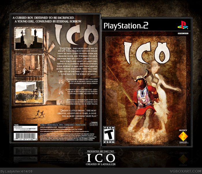
The final part of the Prohibited Art project. If you haven't seen the first part yet, here's the link:
link
I feel that seeing both boxes is vital in appreciating the nature of this project- as both are really just two sides of the same coin. While I went for a "light" aspect for the first one, for this one, I went for a "dark" theme to portray that feel of the game.
This is my most challenging project by far...and ironically, it also turned out as my best, considering that I was most satisfied with how this turned out compared to my previous projects. I had to do with the few materials that this game has. Indeed, it was really back to the basics for me, since I thought more about what truly makes a boxart, and what I want to portray in the box in order to convey its feel. I went for a brown color scheme to have that almost archaic appeal to it as well as deciding to go with a simplistic, but artistic style to convey the loneliness the 2 main characters felt in the game.
"Atmosphere" was my focus on this particular one, which is fleshed out by the use of light and shadows to create a totally original impression. Best enjoyed in full and cheers! ;)
-LK
P.S. @shady, yeah...I didn't want to go with a full border on the front, since I think it would've looked gaudy and it also wouldn't make room for that vital graphic element on the bottom. :)
[ Reply ]
Answer muh question, nub.
EDIT: Wait... Never mind... Not really a question. >__>
Get on AIM, nub.
Edited at 1 decade ago
[ Reply ]
Ow god, you also know how to photoshop almost no art into a splendid boxart. And now it's time for you to start the FFXIII Fabula Nova Crystallis boxart collaboration!
[ Reply ]
Hof... NAO!
again, it fits with the atmosphere of the game. as did the SOTC box *aplause* fav'd ;)
[ Reply ]
Very well done love it
[ Reply ]
Wow. You took nothing and made something out of it.
..And that something is amazing.
The graphics flow like they were meant to be together, and the lighting/rust effects are top-notch.
Superbulantastic job. (Yes, I made up a whole new word so I could describe this box.)
Edited at 1 decade ago
[ Reply ]
Woooo... really love this one... box and the game, and really sets the game well. great job! ;)
[ Reply ]
well Al, I must say I almost missed this.
superb <3
[ Reply ]
...I think that was the fastest HoF ever...
[ Reply ]
.......no words just a fav
[ Reply ]
#18, I totally agree. +fav
[ Reply ]
Well, just noticed that both Shadow of the Colossus and ICO are both produced and directed by the Ueda guy, right? right. I'll bet you knew that before you made the two in a series :) but yeah, fantastic job and congrats on Hall of Fame as usual :D btw, I got AIM back, so I'll try and get in the habbit of going back on there :D :D
[ Reply ]
This box sucks!! And so do you!!
*faves* :p
EDIT: LK, why aren't you responding to any of my messages? =(
Edited at 1 decade ago
[ Reply ]
Whoa....thanks for the HoF favs and comments guys. ;)
#21, Yeah...sorry about that. I've been very tired lately, but it's coming along nicely though. No worries, my friend. :)
EDIT: #20, haha, yes indeed. SotC is the prequel for ICO, so naturally...I designed a box for it first. :D
Edited at 1 decade ago
[ Reply ]
Have my babies.....
[ Reply ]
#23- NO! Have MY babies!! D:
[ Reply ]
Amazing. I wish I could replace the godawful cover with this!
[ Reply ]
just that little hand-in-hand symbol below on the front cover is random, but everything else is [petergriffin]SHWEEEET[/petergrifin]
[ Reply ]
d-d-d-dude...
[ Reply ]
Can't fave enough! CD ROM?...well whatever, Awesome.
[ Reply ]
#26, Hey...I like it. ;)
#28, Thanks. And since this is the NA version box, it did come out in CD ROM format. The PAL version was in DVD ROM.
Which sucks...because when I recently bought the game, it wouldn't play on my ps2- my ps2 was getting old and wouldn't play CD ROM games anymore. Though I was able to remedy it with the scotch tape method. :D
[ Reply ]
It looks awesome, I am in love with the back! Wonderful! +fav
[ Reply ]
I must have this game.
[ Reply ]
#29, I see. I didn't know different region versions of a game could come on different disc formats. I really want to make ICO and Shadow of the Colossus boxes to but I keep failing :(
[ Reply ]
Hah, remember when you said you thought this was gonna be your personal worst, fave-wise? :P That was funny.
[ Reply ]
Wonderful game, and brilliant box too. Great use of texture and superb blending btw. I wanna play this now =) 7/5
[ Reply ]
splendid! great work
[ Reply ]
Thanks guys. :)
I updated with a printable version for those who are interested. I know most of you might not have it, since it's quite rare...but hey, who knows, right?
Besides...I really wanted to replace that awful official NA cover sitting on my desk right now. ;)
[ Reply ]
I love you.
[ Reply ]
#37, Errr...thanks? lol XD
Glad you like it. :) Though if you're planning on downloading the printable...I'm gonna have to ask you to wait up a bit since I just noticed that I overdid the sharpening on it and it doesn't look as smooth as the original.
Will update tonight, so my apologies for any inconveniences.
Edited at 1 decade ago
[ Reply ]
woah
[ Reply ]
#38, Why didn't you put in the spine in the first place? It's gorgeous.
[ Reply ]
#40, I don't think it's necessary and it would also detract attention from the front and back...
The printable version was updated to a 300 dpi setting...(that's why it's a bit hazy at 100% view) But I assure you that it still looks great when printed out- especially considering that I printed a 72 dpi one earlier and that one still looked decent, so just imagine how a higher res version would look like then. ;)
It was a pain to increase the resolution/size of the printable with minimal quality loss though. From now on, I'll design my boxes starting at 200 or 300 dpi so I'd have no trouble making a printable version of it. :D
[ Reply ]
Awesome Box!!! fav, All of your boxes are in the HAll, keep making amazing boxes.
[ Reply ]
make a new one, fave
[ Reply ]
awsome! 5/5 and fave! woooooot one or two days until ladykiller has been on this site for exactly 1 year! congratz...... sounds like im a stalker for knowing that lol
[ Reply ]
#44, lol...errr yeah. :]
Which reminds me, I have to start on that 1 year anniversary box soon. ;)
[ Reply ]
Masterworks. This deserves it.
[ Reply ]
how do i save this as an .ico XD
jk nice box :D
[ Reply ]
Odd, I don't see too much on this box that should make it to the Master Works. Well, the design is cool and the apresentation too... meh maybe it's just me
[ Reply ]
incredible
[ Reply ]