theme02 CompactDisc DaftPunk [ Buy Daft Punk: D... at Amazon ] By Bastart 49 on August 19th, 2011 No Printable Available [ Box updated on August 19th, 2011 ] [ original ] Daft Punk: Discovery Cover Comments Comment on Bastart's Daft Punk: Discovery Cover. Cancel Reply Bastart 49 [ 1 decade ago ] My 2nd submission for the Theme of the Month. This time it's an ode to the epic duo Daft Punk. I've chosen Discovery, because I found the original CD cover, a bit boring. I've tried to spice it up a little. I Hope You'll like it? Edited at 1 decade ago [ Reply ] Daemon 46 [ 1 decade ago ] Yes. [ Reply ] Bastart 49 [ 1 decade ago ] #2, Thanks a bunch ;) [ Reply ] Reza 41 [ 1 decade ago ] Wow, that's great. Really captures their style. Awesome job. I'd get rid of the Disc logo on the front and back though. And you probably should credit the creator of the plastic overlay too. [ Reply ] Bastart 49 [ 1 decade ago ] #4, Thanks and yeah, I totally forgot to give credits :/ Credits to link for the slim case. [ Reply ] Bastart 49 [ 1 decade ago ] #4, about the disc logo, I could only remove it of the front? btw, big thanks for the faves. Edited at 1 decade ago [ Reply ] deiviuxs 46 [ 1 decade ago ] Very nice. I love the colors and sleekness of the case. Good job! [ Reply ] Bastart 49 [ 1 decade ago ] #7, Thanks! :) That jewel-case they've made available, is just awesome. I own them big time! Edited at 1 decade ago [ Reply ] ShatteringKatana 8 [ 1 decade ago ] This case is just sweet :Q____. Good Job :) [ Reply ] Throavium. 26 [ 1 decade ago ] A fantastic cover for a fantastic album. [ Reply ] Bastart 49 [ 1 decade ago ] Thanks people, always like some good feedback :) [ Reply ] Daemon 46 [ 1 decade ago ] You need to make Justice box next. [ Reply ] Bastart 49 [ 1 decade ago ] #12, Actually, I had that in mind ;) Although, it's really hard to make a better cover than 'Cross', but I'll give it a try. Maybe, I'll just make up an album of remixes of various tracks they've done? Edited at 1 decade ago [ Reply ] Reza 41 [ 1 decade ago ] #6 you've taken care of the front one, i'd just flip the front and use it for the back. Either way, it looks heaps better without the front one. And this also deserves more attention! Whats with music boxes on this site not getting much attention? [ Reply ] Bastart 49 [ 1 decade ago ] #14, Thanks. Yeah, I just removed the one on the front, I did wanted a Disc logo somewhere. I seriously don't know :/ it actually surprises me, that I've already got 9 fav's for it. Edited at 1 decade ago [ Reply ] Reza 41 [ 1 decade ago ] #15 needs more imo, this is great. Like i said, really captures Daft Punks visual tone really well. [ Reply ] deiviuxs 46 [ 1 decade ago ] #16, Agree, this definitely deserves more attention and favs. The colors and layout is great and fits the "band" well. [ Reply ] Bastart 49 [ 1 decade ago ] #16, 17 Thanks guys, appreciate it :) but, I think music boxes are just not the most interesting things on the site, for most people, to take a look at? (not speaking for myself here) I think that's probably why the website is called 'VGBoxArt'? and they've made up this competition, to give it some more attention. I'd would probably slowly dry up, along with all the others.... Edited at 1 decade ago [ Reply ] Magical 41 [ 1 decade ago ] I really love this! [ Reply ] The90sKid 38 [ 1 decade ago ] Fuck. Yes. This is all kinds of awesome. [ Reply ] Bastart 49 [ 1 decade ago ] #19, 20 Wow! Thanks Guys ;) [ Reply ] TwistedTinkerToy 43 [ 1 decade ago ] It would be much cooler, in my opinion, if you took off the shine on it and made the presentation a color that didn't blend with the box so much. Edited at 1 decade ago [ Reply ] ZombieDeadpool8 23 [ 1 decade ago ] Also, yes. [ Reply ] Bastart 49 [ 1 decade ago ] #22, I'll see what I can do about it. Reduce the shine and make the background another color, got it. Thanks for the comments :) [ Reply ] deiviuxs 46 [ 1 decade ago ] I personally love the shine and black background. It fits the tech-look for the cover. I wouldn't change a thing. [ Reply ] twoxT 34 [ 1 decade ago ] #25, this. [ Reply ] sd1833 48 [ 1 decade ago ] A bit late, but better than never. Pretty much what I would expect from a Daft Punk CD. One of your better works, I think. [ Reply ] Bastart 49 [ 1 decade ago ] #27, Thanks :) it doesn't really matter if you're a bit late, I'm always happy to see some interest by a favor or comment ;) [ Reply ]
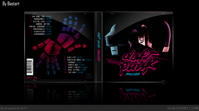
 Daft Punk: Discovery Cover Comments
My 2nd submission for the Theme of the Month.
This time it's an ode to the epic duo Daft Punk.
I've chosen Discovery, because I found the original CD cover,
a bit boring. I've tried to spice it up a little. I Hope You'll like it?
Edited at 1 decade ago
[ Reply ]
Yes.
[ Reply ]
#2, Thanks a bunch ;)
[ Reply ]
Wow, that's great. Really captures their style. Awesome job. I'd get rid of the Disc logo on the front and back though.
And you probably should credit the creator of the plastic overlay too.
[ Reply ]
#4, Thanks and yeah, I totally forgot to give credits :/
Credits to link for the slim case.
[ Reply ]
#4, about the disc logo, I could only remove it of the front?
btw, big thanks for the faves.
Edited at 1 decade ago
[ Reply ]
Very nice. I love the colors and sleekness of the case. Good job!
[ Reply ]
#7, Thanks! :)
That jewel-case they've made available, is just awesome. I own them big time!
Edited at 1 decade ago
[ Reply ]
This case is just sweet :Q____. Good Job :)
[ Reply ]
A fantastic cover for a fantastic album.
[ Reply ]
Thanks people, always like some good feedback :)
[ Reply ]
You need to make Justice box next.
[ Reply ]
#12, Actually, I had that in mind ;)
Although, it's really hard to make a better cover than 'Cross', but I'll give it a try.
Maybe, I'll just make up an album of remixes of various tracks they've done?
Edited at 1 decade ago
[ Reply ]
#6 you've taken care of the front one, i'd just flip the front and use it for the back. Either way, it looks heaps better without the front one.
And this also deserves more attention! Whats with music boxes on this site not getting much attention?
[ Reply ]
#14, Thanks.
Yeah, I just removed the one on the front, I did wanted a Disc logo somewhere.
I seriously don't know :/ it actually surprises me, that I've already got 9 fav's for it.
Edited at 1 decade ago
[ Reply ]
#15 needs more imo, this is great. Like i said, really captures Daft Punks visual tone really well.
[ Reply ]
#16, Agree, this definitely deserves more attention and favs. The colors and layout is great and fits the "band" well.
[ Reply ]
#16, 17 Thanks guys, appreciate it :)
but, I think music boxes are just not the most interesting things on the site,
for most people, to take a look at? (not speaking for myself here)
I think that's probably why the website is called 'VGBoxArt'?
and they've made up this competition, to give it some more attention.
I'd would probably slowly dry up, along with all the others....
Edited at 1 decade ago
[ Reply ]
I really love this!
[ Reply ]
Fuck. Yes.
This is all kinds of awesome.
[ Reply ]
#19, 20 Wow! Thanks Guys ;)
[ Reply ]
It would be much cooler, in my opinion, if you took off the shine on it and made the presentation a color that didn't blend with the box so much.
Edited at 1 decade ago
[ Reply ]
Also, yes.
[ Reply ]
#22, I'll see what I can do about it. Reduce the shine and make the background another color, got it.
Thanks for the comments :)
[ Reply ]
I personally love the shine and black background. It fits the tech-look for the cover. I wouldn't change a thing.
[ Reply ]
#25, this.
[ Reply ]
A bit late, but better than never.
Pretty much what I would expect from a Daft Punk CD. One of your better works, I think.
[ Reply ]
#27, Thanks :) it doesn't really matter if you're a bit late,
I'm always happy to see some interest by a favor or comment ;)
[ Reply ]