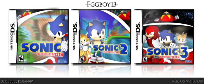
This is my simple vision of if the "New Super Mario Bros." sorta thing would have happened to the Sonic franchise.
Props go out to ~Chris-Supernerd of DA for these beutiful renditions of the sonic characters. (All bu knuckles)
These are good but not great or "truely epic".
I dislike how the logo is exactly the same on every box, but just with a number after it. The ESRB and Sega logos vary in size and style on each box. And I personally think it would look better if Knuckles was up with Robotnik on the third box considering Knuckles is a bad character and all and is actually partners with Robotnik.
#9, I kept the logo the same in each one cause that's how it's done in the official boxes.
And Knuckles, he was on the same side as robotnik, but only becuase he bought into the b******t that he told him, later when robotnik stol the master emerald, he helped sonic for the rest of the story and on into the next game.
#10 Actually Knuckles doesn't start helping Sonic until the next game, Sonic & Knuckles. And the logos are not the same on the official boxes! Well, not in Europe at least :p
While I like these boxes, they're significantly better than anything you've done (Mostly due to the artwork, I'm afraid) my biggest complaint is the motion blur. Sonic's fast, but he doesn't constantly need a zoom-blurred background.
Also, New Super Mario Bros. isn't a remake, it's a new game, so using that basis as the concept behind this is flawed, as these just look like aesthetic remakes.
 The Sonic The Hedgehog Remake Collection Box Cover Comments
This is my simple vision of if the "New Super Mario Bros." sorta thing would have happened to the Sonic franchise.
Props go out to ~Chris-Supernerd of DA for these beutiful renditions of the sonic characters. (All bu knuckles)
Enjoy!!
[ Reply ]
Truly epic, my friend.
[ Reply ]
#2, no doubt, were gonna see like 500 sonic kiddies fav this.
[ Reply ]
I like the fronts, I'd like to see at least one back as well.
[ Reply ]
#3-4, very much agreed.
[ Reply ]
Good use of Chris's renders.
[ Reply ]
#4, I tried, but I didn't like whatI had, I never got anywhere, decided to forget it...
[ Reply ]
Amazing Eggboy! Probably some of your best work!
I wish these were real!
Edited at 1 decade ago
[ Reply ]
These are good but not great or "truely epic".
I dislike how the logo is exactly the same on every box, but just with a number after it. The ESRB and Sega logos vary in size and style on each box. And I personally think it would look better if Knuckles was up with Robotnik on the third box considering Knuckles is a bad character and all and is actually partners with Robotnik.
[ Reply ]
#9, I kept the logo the same in each one cause that's how it's done in the official boxes.
And Knuckles, he was on the same side as robotnik, but only becuase he bought into the b******t that he told him, later when robotnik stol the master emerald, he helped sonic for the rest of the story and on into the next game.
Edited at 1 decade ago
[ Reply ]
#10 Actually Knuckles doesn't start helping Sonic until the next game, Sonic & Knuckles. And the logos are not the same on the official boxes! Well, not in Europe at least :p
[ Reply ]
#11, Ah damn, youre right.
[ Reply ]
I think I'll do a volume 2, comtaining Sonic & Knuckles, Sonic CD, and Knuckles Chaotix.
[ Reply ]
Double post, whoops my bad.
Edited at 1 decade ago
[ Reply ]
While I like these boxes, they're significantly better than anything you've done (Mostly due to the artwork, I'm afraid) my biggest complaint is the motion blur. Sonic's fast, but he doesn't constantly need a zoom-blurred background.
Also, New Super Mario Bros. isn't a remake, it's a new game, so using that basis as the concept behind this is flawed, as these just look like aesthetic remakes.
[ Reply ]