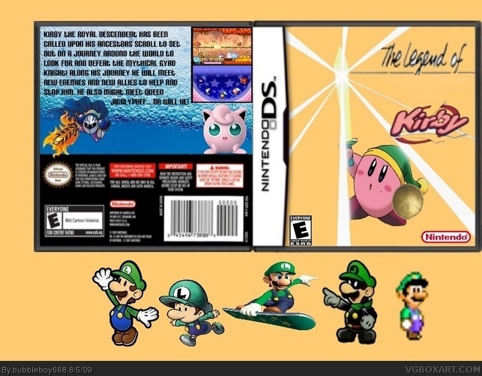
The template is very blurry in full view. Also, the renders on the front are floating, the logo is choppy, and the back text bores me. But, it's not a bad setup you got going there. 2/5, if you ask me.
Ok, I don't want to sound harsh, but for a tenth box, this is really bad. Please go read some tutorials online. Because the text is way to plain, why are there 3 Kirbies, You used the same Kirby twice on the front, the Kirbies are floating, and the logo is very choppy. Also, the idea is just stupid.
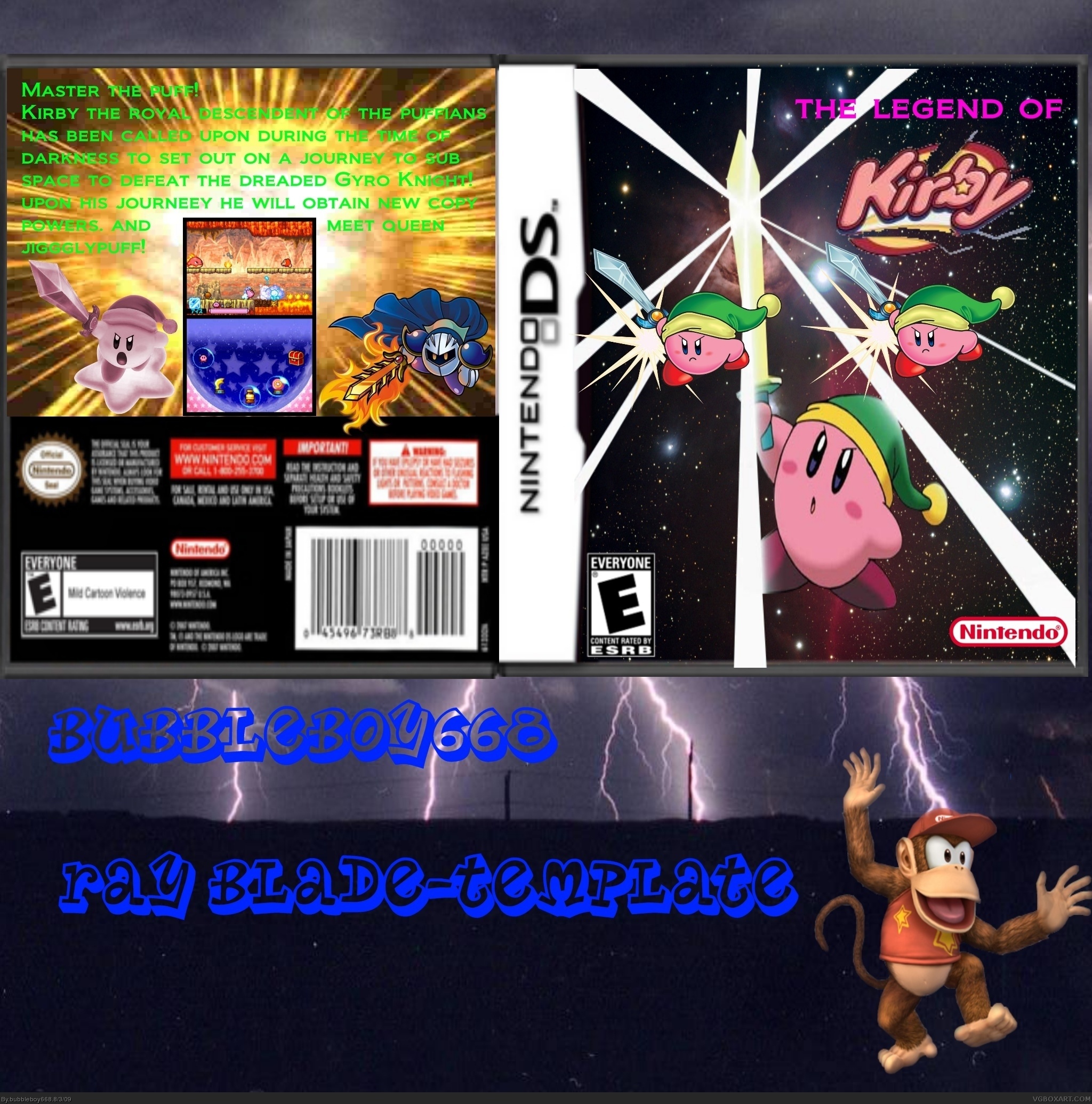
But I will admit, it's alot better than your others! :D
why is diddy there if your avatar is luigi? anyway, the box is okay i guess, but you should stop with paint, get paint.net if anything, its just like paint only better.
When I clicked this box I tought I was gonna love it but... You used the same kirby twice on the front, your fon't and color looks horrible, "0The legend of" made me think about "zelda" but the only thing it has in common is the green hat... I had expected you'd fit the story to it!
Front is better, only change the logo abit.
Text is a bit better but still you gotta change the font and the color, meta knight is stretched and igglypuff is badly rendered.
 The Legend Of Kirby Box Cover Comments
My 10 box hope you enjoy.
[ Reply ]
The template is very blurry in full view. Also, the renders on the front are floating, the logo is choppy, and the back text bores me. But, it's not a bad setup you got going there. 2/5, if you ask me.
[ Reply ]
Ok, I don't want to sound harsh, but for a tenth box, this is really bad. Please go read some tutorials online. Because the text is way to plain, why are there 3 Kirbies, You used the same Kirby twice on the front, the Kirbies are floating, and the logo is very choppy. Also, the idea is just stupid.
But I will admit, it's alot better than your others! :D
[ Reply ]
why is diddy there if your avatar is luigi? anyway, the box is okay i guess, but you should stop with paint, get paint.net if anything, its just like paint only better.
[ Reply ]
When I clicked this box I tought I was gonna love it but... You used the same kirby twice on the front, your fon't and color looks horrible, "0The legend of" made me think about "zelda" but the only thing it has in common is the green hat... I had expected you'd fit the story to it!
[ Reply ]
my box has now been updated
[ Reply ]
I liked it better before
[ Reply ]
ya so did i but all the critique comments so i changed it
[ Reply ]
Front is better, only change the logo abit.
Text is a bit better but still you gotta change the font and the color, meta knight is stretched and igglypuff is badly rendered.
[ Reply ]
my new updated box
[ Reply ]
its my most veiwed box so far
[ Reply ]
i think this is my best box
[ Reply ]