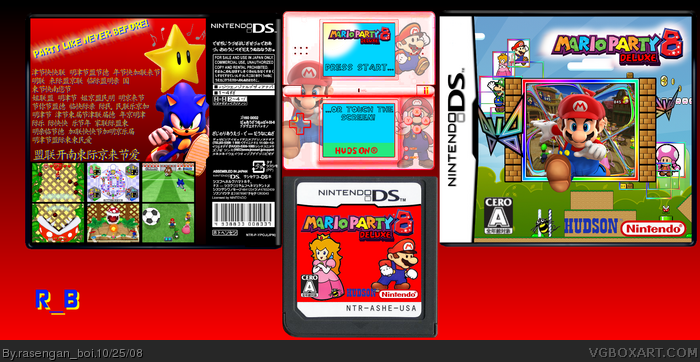
credit to tleeart for the border on the cover, and somebody for the temp, ds i cut out myself, and sonic's in the deluxe version, because he and mario are appearing together a bit these days...
I think you did good. But the DS is really un-needed, and a bright red background isn't where it's at. Try making the background a little less on the eyes, and implementing a bit more of the game's areas, and attributes into the background. Same goes for the background on the back of the box.
 Mario Party 8 Deluxe Box Cover Comments
credit to tleeart for the border on the cover, and somebody for the temp, ds i cut out myself, and sonic's in the deluxe version, because he and mario are appearing together a bit these days...
[ Reply ]
cool i don't like the ds how it has a red tint but other wise it's good 4.5/5
[ Reply ]
#2, why not fave then, i haven't gotten a fav in like, ever
[ Reply ]
I think you did good. But the DS is really un-needed, and a bright red background isn't where it's at. Try making the background a little less on the eyes, and implementing a bit more of the game's areas, and attributes into the background. Same goes for the background on the back of the box.
[ Reply ]