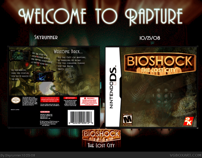
I don't know why it's so small, but whatever. Thanks to the guys that helped me on my WIP. I really liked the idea fo a Bioshock game on the DS, since a ot of stuff goes onto the DS anyway. As I said in the forums, this started out as a Mario Hoops box, but the color scheme in the beginning was perfect for Bioshock. So thats where I came up with the idea fr Bioshock DS.
Credit to Soundwave for the logo, Numero for the template, and massive thanks again to everyone in the forums. So, enjoy. :)
Update it, and it will be bigger. Just update with the same image.
As far as the box...the blending's off on the front...the back seems a bit empty, like everything was thrown on there more than placed with a real design idea. Generally people read from left to right, so it's not really a good idea to put your main description and tagline on the right of the box, after all the screenshots.
Koopa's right about the back, things should be on the other side. The front is pretty darn good, but the Main character should be more up front, putting him faded in the back was kind of not a good idea. Outside of those two things, I think this is a very nice box all around.
I dont like what you did to the esrb and its a little squished. Same with the 2k logo but overall, the box looks good.. and one more thing, there is no esrb on the back... still this box is great!!
 BioShock: The Lost City Box Cover Comments
View full please.
I don't know why it's so small, but whatever. Thanks to the guys that helped me on my WIP. I really liked the idea fo a Bioshock game on the DS, since a ot of stuff goes onto the DS anyway. As I said in the forums, this started out as a Mario Hoops box, but the color scheme in the beginning was perfect for Bioshock. So thats where I came up with the idea fr Bioshock DS.
Credit to Soundwave for the logo, Numero for the template, and massive thanks again to everyone in the forums. So, enjoy. :)
#2 Ok, thanks.
Ok updated, thanks Koopa. :D
Edited at 1 decade ago
[ Reply ]
Update it, and it will be bigger. Just update with the same image.
As far as the box...the blending's off on the front...the back seems a bit empty, like everything was thrown on there more than placed with a real design idea. Generally people read from left to right, so it's not really a good idea to put your main description and tagline on the right of the box, after all the screenshots.
Edited at 1 decade ago
[ Reply ]
#2 Thanks for the criticism. And everyone else thanks for the favs.
[ Reply ]
I'd like Big Daddy to be a bit more visible on the front, good otherwise.
[ Reply ]
:D
your best box
Edited at 1 decade ago
[ Reply ]
Koopa's right about the back, things should be on the other side. The front is pretty darn good, but the Main character should be more up front, putting him faded in the back was kind of not a good idea. Outside of those two things, I think this is a very nice box all around.
[ Reply ]
nice, your best yet
though blending on front is off a bit
[ Reply ]
aswome what the game bioshock about lliek what's the story?
[ Reply ]
this is freaking AWSOME ;D 5/5
[ Reply ]
Thanks for all the comments and favs guys :D
[ Reply ]
I know you worked hard on this, so I definitely fav this. It's not perfect, needs a little more pop to it. Still, I rate it 4/5
[ Reply ]
Thanks Tleeart :)
[ Reply ]
I dont like what you did to the esrb and its a little squished. Same with the 2k logo but overall, the box looks good.. and one more thing, there is no esrb on the back... still this box is great!!
Edited at 1 decade ago
[ Reply ]
good idea, but i doubt it would happen.
[ Reply ]