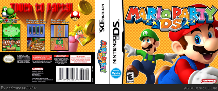
it's good. I think it would even be better with a dif bg, but that's just me. Some game info looks missing in the back too, but I like this one. good job and keep it up.
back = good.
front = not so good. Fill up the front a bit more and give it a better background. Remember, this game is mario PARTY, not mario boring and plain. You want it brought and colourful.
 Mario Party DS Box Cover Comments
pretty fun game =D
[ Reply ]
yeahh i know ..
too plane =/
[ Reply ]
actually I think it looks really good like a hall of fame box. 10/10 +fav
[ Reply ]
Cheers to one of the most underrated artists of this site. Another great box. 5/5 + fav!
[ Reply ]
looks good
5/5
[ Reply ]
really good 5/5
[ Reply ]
Looks pretty good...4/5.
[ Reply ]
I like it.
[ Reply ]
nah man its really cool, you cant expect every box to be your next best one.
[ Reply ]
It's good, but not great...
A little more on the front would've been better.
4/5
[ Reply ]
very good. 4.5/5
[ Reply ]
It's great! 5/5!
[ Reply ]
it's good. I think it would even be better with a dif bg, but that's just me. Some game info looks missing in the back too, but I like this one. good job and keep it up.
[ Reply ]
back = good.
front = not so good. Fill up the front a bit more and give it a better background. Remember, this game is mario PARTY, not mario boring and plain. You want it brought and colourful.
I like it though. 3/5
[ Reply ]