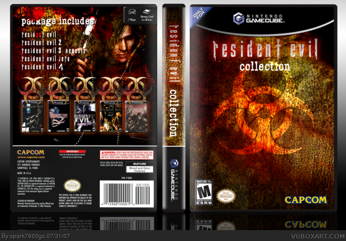
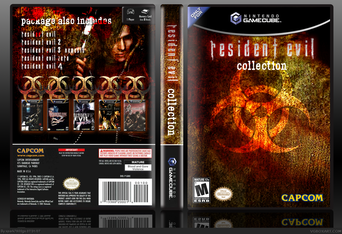
amazing, but one thing i've noticed, it says package also includes, you never listed what else, maybe change it to package includes,
but great box overall
This is rather good and you know what you're doing - however I'm not quite as blown away as the others... the front overuses scan lines a bit too much - try some other effects. Also, the logo placement is off. never put a logo on the direct top of the box or the direct bottom. somewhere in the middle should be nice - but you may have to make the biohazard sign a bit more noticeable if you're going to move it.
I also agree with dmshaposv, the symbol is overused on the back, and it's distracting. The font listing the games is also overused - try using the game's official logos rather than the font used in most resident evil games - perhaps the change in color and texture will offer some variety.
 Resident Evil Collection Box Cover Comments
really nice work spark^^
4.5/5
[ Reply ]
amazing, but one thing i've noticed, it says package also includes, you never listed what else, maybe change it to package includes,
but great box overall
[ Reply ]
2 thumbs up!
My only gripe is the repetition of the biohazard logo on the back cover. Other than that, its quite good.
Edited at 1 decade ago
[ Reply ]
Really great! 4.5/5
[ Reply ]
holy sh*t, this is killer
[ Reply ]
Amazing! 5/5
[ Reply ]
This is rather good and you know what you're doing - however I'm not quite as blown away as the others... the front overuses scan lines a bit too much - try some other effects. Also, the logo placement is off. never put a logo on the direct top of the box or the direct bottom. somewhere in the middle should be nice - but you may have to make the biohazard sign a bit more noticeable if you're going to move it.
I also agree with dmshaposv, the symbol is overused on the back, and it's distracting. The font listing the games is also overused - try using the game's official logos rather than the font used in most resident evil games - perhaps the change in color and texture will offer some variety.
Other than that, very nice!
[ Reply ]
Oh, and the resident evil 4 box looks a little washed out.
[ Reply ]
Well I think it's great. I like the rusty effects.
[ Reply ]
Looks cool but there is why to many logos on the back sorry.
[ Reply ]
You're forgetting Resident Evil Code: Veronica X
Still pretty good!
[ Reply ]
Spark > You.
I love the template, by the way.
[ Reply ]
Thsn3edzhawlofaimnaoplzthx.
[ Reply ]
Smashing!
[ Reply ]
this is sweet, double fav
[ Reply ]
Orgasmic!
[ Reply ]