cred to crayon man for the temp and Mist for the Ubisoft lines
I enjoyed making this one, I had to make the "developed and published by ubisoft" logo and change the logo color from black to white. anywayz, plz view in full, and comment.
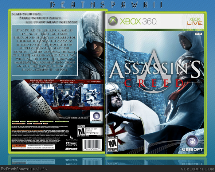
The front's great. But you can see the seams on the diagonal line pattern. =P
And the text on the back might have looked more clean if it it was justified along the shoulder of Altair.
But still, that's just a little nit-picking. Amazing box.
Everythings seems really nice and crisp. My only gripe is the box which you put the text in. Thake it away, and the text a shadow. Otherwise, very nise.
 Assassin's Creed Box Cover Comments
cred to crayon man for the temp and Mist for the Ubisoft lines
I enjoyed making this one, I had to make the "developed and published by ubisoft" logo and change the logo color from black to white. anywayz, plz view in full, and comment.
EDIT: quick update, had to pop the NTS in there
Edited at 1 decade ago
[ Reply ]
The front's great. But you can see the seams on the diagonal line pattern. =P
And the text on the back might have looked more clean if it it was justified along the shoulder of Altair.
But still, that's just a little nit-picking. Amazing box.
[ Reply ]
Awesome, I like the way that you presented the screenshots.
[ Reply ]
#2-3, thx guys, I put a lot of effort in thia
[ Reply ]
This is great.The front works really well. :)
[ Reply ]
#5, thx dude =)
[ Reply ]
Everythings seems really nice and crisp. My only gripe is the box which you put the text in. Thake it away, and the text a shadow. Otherwise, very nise.
[ Reply ]
looks good to me ;)
[ Reply ]
cough, bump....very good, for some reason, I like what you did with the screenshots...looks good
[ Reply ]
Dont think the man on front is neccessary hes looking at the guy saying "Look at his D***"
[ Reply ]