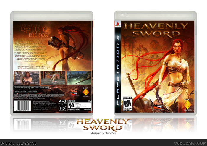
Spent a fair amount of time on this, with colours and the logo, need to do some slight modifications to the back, so will update soon.
comments please!
its actually does look alot like mist's!
well those pics are just the best ones to make a box with so i chose them, n there isnt exactly tons of artwork to choose from! the back isnt all that similar, its mainly the front. i will need to go back and change somethings on it!
This is very nice, but I think you should change it a bit - as its exactly like mist's - there is some old artwork of nariko, or you could use the nariko in the official cover as Mad spike did.
This is a lot different to your first version and it's much better, seems like you put a lot more work into the back cover rather than the front. And i like her legs on top but you need to either move her up slightly or the screen shots down to be able to see that image better.
#11, I think it will be better if you drag the back art higher. So the legs was above the screens. Legs and the screens lower.. Well, you know. After that there will be less empty space on the top too.
#19, I think that the screens should be bigger. They should begins from the top of the box. Cos there is too big empty space on the top.
I think that the Faces should be moved lower under the hands of the Nariko.
P.S. Where do you get this art? Cos I scan all the web again and can't find it. You can PM me if this is a confident info ;)
P.P.S. Join the competition, man!!! link
 Heavenly Sword Box Cover Comments
Spent a fair amount of time on this, with colours and the logo, need to do some slight modifications to the back, so will update soon.
comments please!
[ Reply ]
wow, this reminds me a ton of Mist's box....
[ Reply ]
its actually does look alot like mist's!
well those pics are just the best ones to make a box with so i chose them, n there isnt exactly tons of artwork to choose from! the back isnt all that similar, its mainly the front. i will need to go back and change somethings on it!
[ Reply ]
Wow..I actually thought mist updated his box.
This is very nice, but I think you should change it a bit - as its exactly like mist's - there is some old artwork of nariko, or you could use the nariko in the official cover as Mad spike did.
[ Reply ]
Artworks are very very overused.
But box is cool.
[ Reply ]
im in the process of changing it!
[ Reply ]
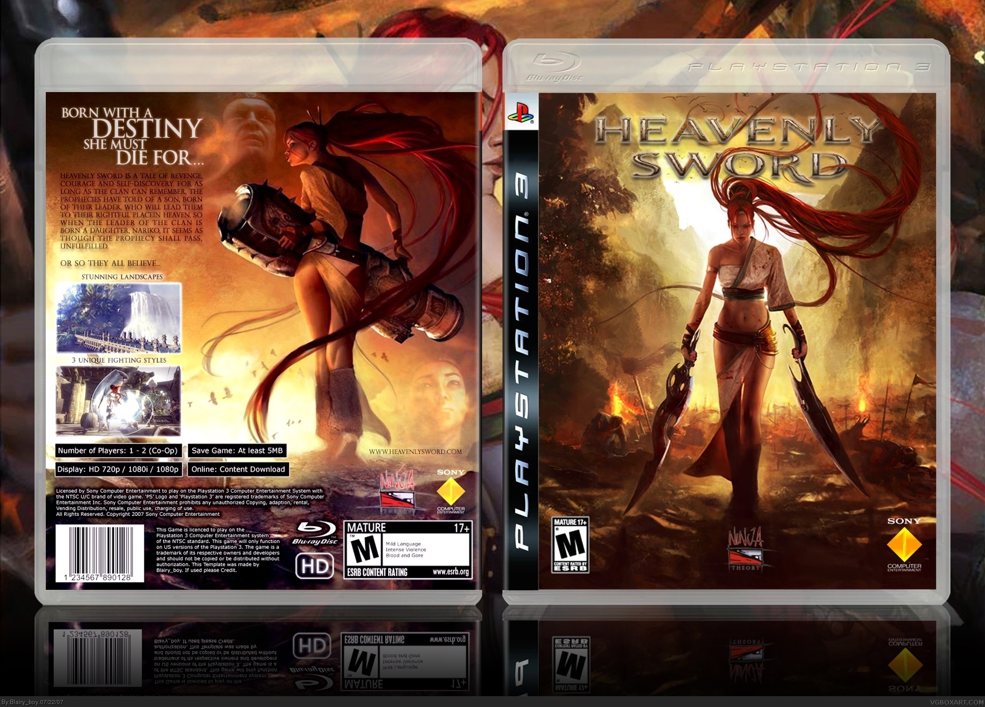
changed the back artwork to the front, added new artwork to back, more faces in the sky and more screenshots!
any better?
[ Reply ]
Awesome update
[ Reply ]
This is serious awesome shit.
5/5 +fav
[ Reply ]
New art is awsome (I can't find this one in the net - only the scan) but I can't see her legs becos of screens :(
[ Reply ]
you want me to put the legs infront!, fine ill try it!
[ Reply ]
Excellent work Blairy_boy. This is well made, and great find with the concept art in the back.
My only complaint is that the top half of the right side in the back cover feels a bit empty. Maybe some text or some screen could be put there.
Edited at 1 decade ago
[ Reply ]
well if you look closely, there are the faces in the sky! but do something abit more than that?
[ Reply ]
updated, cut narikos legs out and placed them ontop of pics, didnt look to good at first, so i added another screen.
also made the faces in the sky more visable, so it doesnt look as empty!
comments pls
Edited at 1 decade ago
[ Reply ]
This is a lot different to your first version and it's much better, seems like you put a lot more work into the back cover rather than the front. And i like her legs on top but you need to either move her up slightly or the screen shots down to be able to see that image better.
[ Reply ]
#11, I think it will be better if you drag the back art higher. So the legs was above the screens. Legs and the screens lower.. Well, you know. After that there will be less empty space on the top too.
[ Reply ]
or what if i put the two pictures that are on the left side, above the two on the right side so its in a bit of a square formation.
[ Reply ]
@#17,
Rather than that, don't have any screens on the left, and just three screens on the right hand side, below the face. Text (synopsis) position is fine.
Sorta like this Final Fantasy box, to see what I'm talking about.
link
This way, your artowk is seen, along with Nariko's legs. And we all know how important it is so flaunt the legs of your leggy heroine in a boxart! ;)
[ Reply ]
update! i seemed to try everything with the screens but none of them seemed to fit perfectly, so i have just left it how dmshaposv asked!
pls comment!
[ Reply ]
#19, I think that the screens should be bigger. They should begins from the top of the box. Cos there is too big empty space on the top.
I think that the Faces should be moved lower under the hands of the Nariko.
P.S. Where do you get this art? Cos I scan all the web again and can't find it. You can PM me if this is a confident info ;)
P.P.S. Join the competition, man!!!
link
Edited at 1 decade ago
[ Reply ]
Psstt..pm me the source of the image too, blairy. ;)
I might not use it in a boxart, since its already been used to great effect here, but it could come in handy making some website templates.
[ Reply ]
#21, Resolution is not big :)
It's a new art - it's hard to find the high res in the web right now :)
[ Reply ]
i like the art on the back alot
[ Reply ]
Great box, but I honestly think that version one is way better.
[ Reply ]
Umm.....wtf?
No HoF?
[ Reply ]
done a complete overhaul on this box, new front, new back, new layout, etc...
hope you like it!
[ Reply ]