Well, here it is, my personal fav. I think its just like Dark_Shadow said, my best so far. Lol, if only i could add my own box to fav.
But i actually made it by accident, ive just been adding stuff to the boxart preserving that hellish and evil look without even thinking about the overall look and then BAM!
Feel free to leave comments or/and critiques.
Oh, btw, its my submission to VGBA Summer competition roound 3. ;)
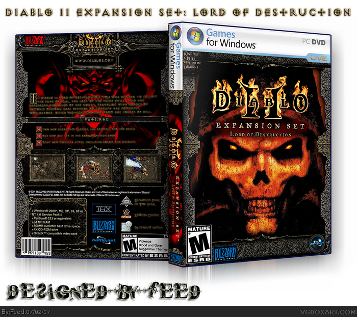
The design is pretty decent, though i think that the border graphic is best suited for the back. Having it on the front seems a bit overkill. The text on the back needs to be easier to read. Maybe try using a lighter glow effect or use a different font color so it stands out a bit more.
Overall i like it and think you pulled off that hellish look you were shooting for. Nice job. (^^)d
#4, trust me, the text look just fine, when its ri-res and 2d you can easily read it. I even tried to print it - looks damn awesome and readable. The small size of this picture makes the text look kinds unreadable, but its not ). The font is the exact copy of the one from the game. The 3-d text effect is from the game too. So, i don't want to change it, it would look wrong. And btw, these gothinc-style letters fit the game perfectly.
And yea, i tried that idea with the border only on the back, but it looks bad, really )
#6, well yea, if you look real close you may find some details from the game. Like the demon that is holding the Battle.net logo is from the actual game, he is holding the orb of mana )). The boarder is from the game too, if you open the inventory in the game youll see it)). Then, i couldn't find a good logo of the game on the internet, so i rendered it from the screenshot of the main menu.)) etc.
That box actually made me install the game to take some screens i needed. )
 Diablo II Expansion Set: Lord Of Destruction Box Cover Comments
your best until now :) sooo good man you could be the best boxartists of this site if you continue :P just keep it up *thumbs up*
+ fav
Edited at 1 decade ago
[ Reply ]
Well, here it is, my personal fav. I think its just like Dark_Shadow said, my best so far. Lol, if only i could add my own box to fav.
But i actually made it by accident, ive just been adding stuff to the boxart preserving that hellish and evil look without even thinking about the overall look and then BAM!
Feel free to leave comments or/and critiques.
Oh, btw, its my submission to VGBA Summer competition roound 3. ;)
Yours truly, Feed.
Edited at 1 decade ago
[ Reply ]
Nice 5/5, i really like the back .
[ Reply ]
The design is pretty decent, though i think that the border graphic is best suited for the back. Having it on the front seems a bit overkill. The text on the back needs to be easier to read. Maybe try using a lighter glow effect or use a different font color so it stands out a bit more.
Overall i like it and think you pulled off that hellish look you were shooting for. Nice job. (^^)d
[ Reply ]
#4, trust me, the text look just fine, when its ri-res and 2d you can easily read it. I even tried to print it - looks damn awesome and readable. The small size of this picture makes the text look kinds unreadable, but its not ). The font is the exact copy of the one from the game. The 3-d text effect is from the game too. So, i don't want to change it, it would look wrong. And btw, these gothinc-style letters fit the game perfectly.
And yea, i tried that idea with the border only on the back, but it looks bad, really )
[ Reply ]
I love all the detail you packed into it.
[ Reply ]
#6, well yea, if you look real close you may find some details from the game. Like the demon that is holding the Battle.net logo is from the actual game, he is holding the orb of mana )). The boarder is from the game too, if you open the inventory in the game youll see it)). Then, i couldn't find a good logo of the game on the internet, so i rendered it from the screenshot of the main menu.)) etc.
That box actually made me install the game to take some screens i needed. )
Edited at 1 decade ago
[ Reply ]
Woow! 7 comments!
[ Reply ]
AWESOME.
It looks so damn official.
+FAV
[ Reply ]
looks alot like diablo 2's box art link
[ Reply ]
it looks alot like diablo 2 boxart, and the border doesnt work for the front. i like your other work alot better
[ Reply ]