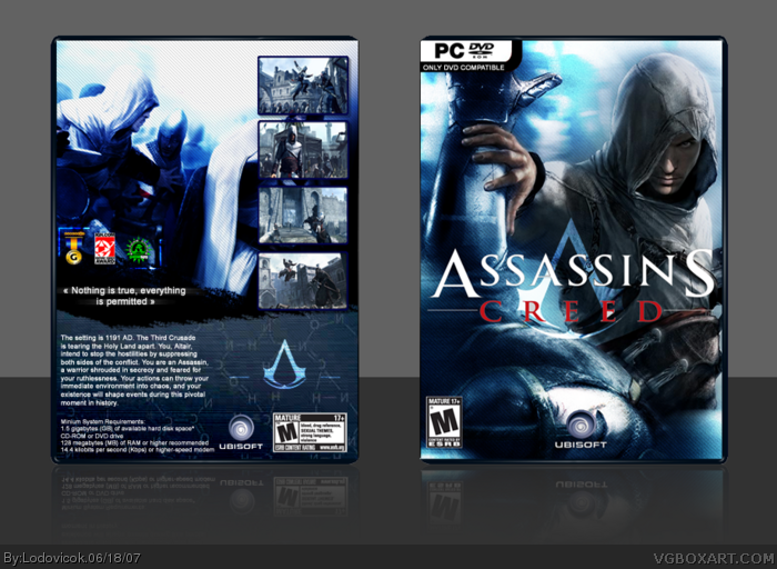
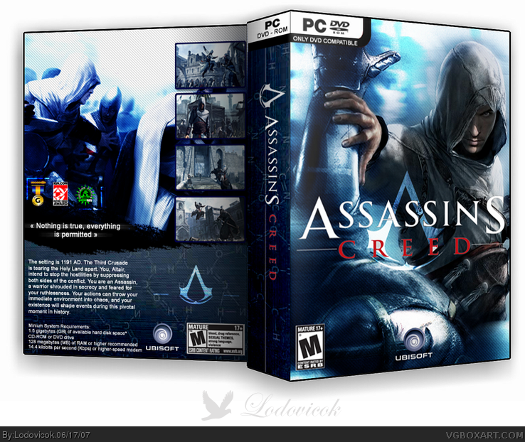
I've always wanted to make an Assassin's Creed box, yet I've also always avoided it because of the challenges it presents with the limited material, and hard to work with wallpapers. Yet around a month ago, I decided that I had might aswell give it a go. I am very, very happy with the result. Hopefully you are too.
it looks very nice, but there is something about it that seems wrong. i don't know what it is. i think it's maybe because the back looks strange with the text down at the bottom, maybe, you could re-arrange everything so the text and those awards are switched around, and that magazine quote is put somewhere else. i also think the spine looks odd, the logo could be bigger since the spine is quite thick. maybe move the ubi logo on the front to the far right so it's not covering the character's face. this isn't my favourite of yours although it's a great effort, so 4.5/5
I love how you added a scientific element to this box. Since the game actually is a sci-fi. (long story...Read the articles about it) But overall I just really like this box. Great job!
#6, you know what im talking about. Until now only Mad Spike used Ign, gamespy and GOTY award tags. This template is veeery similar to Mad Spike's, the pattern looks very similar to the one Mad Spike uses on him boxes.
#10, Your fisrt 3D box was released 7.24.06 (There was one for Windows b4, but I don't count it) link
B4 that box you was making only the front cover in 2D.
My first box was released 7.31.06 link
After 7 days.
My first box that have comments about the game from the leading magazines and awards was released in 8.02.06 link
Your first box that have comments about the game from the leading magazines was released 8.13.06 link
Your first box with awards pictures was released 6.17.07
So, I use this style before you :) That is what Feed i talking about.
I think another thing is what Feed is talking about it's a scanlines effect.
Anyway, I don't care. I think it's not good to talk about someone without his presents.
Mad Spike, you're good, but no one has to give you credit for the idea of magazine quotes or GOTY tags. It's an idea, not a style, and if you don't want to share your ideas with others on the site, don't post your boxes.
Anyway, the box is great. I, too, love the sci-fi element in the box. My friends still don't believe it's a sci-fi.
#13, Sure thing. We talk only about who use this first. And first one was some popular publisher who put this feature on one of there "Game Of The Year Edition" box (I think). So there is nothing much to talk about.
About template. "Only DVD Compatile" template is red on the official boxes. But few days ago I saw it on the C&C box and it was black just like mine. And what now? Publishers stole it from me? Sure thing no, it just a great idea to make it black, so publishers can't past it through. I can't past it too :)
 Assassin's Creed Box Cover Comments
I've always wanted to make an Assassin's Creed box, yet I've also always avoided it because of the challenges it presents with the limited material, and hard to work with wallpapers. Yet around a month ago, I decided that I had might aswell give it a go. I am very, very happy with the result. Hopefully you are too.
Edited at 1 decade ago
[ Reply ]
it looks cool, the only thing strange it that the back seemms a bit empty... 4.6/5
[ Reply ]
it looks very nice, but there is something about it that seems wrong. i don't know what it is. i think it's maybe because the back looks strange with the text down at the bottom, maybe, you could re-arrange everything so the text and those awards are switched around, and that magazine quote is put somewhere else. i also think the spine looks odd, the logo could be bigger since the spine is quite thick. maybe move the ubi logo on the front to the far right so it's not covering the character's face. this isn't my favourite of yours although it's a great effort, so 4.5/5
[ Reply ]
Well, nice actually. Really nice. One thing - what's with the chemistry? I mean those formulas on the back...
and one more thing..Goddamit people, stop making Mad-Spike-like boxes! Come up with your own style!
[ Reply ]
I love how you added a scientific element to this box. Since the game actually is a sci-fi. (long story...Read the articles about it) But overall I just really like this box. Great job!
[ Reply ]
#4, mad spike like boxes? Erm...ok
[ Reply ]
#6, you know what im talking about. Until now only Mad Spike used Ign, gamespy and GOTY award tags. This template is veeery similar to Mad Spike's, the pattern looks very similar to the one Mad Spike uses on him boxes.
[ Reply ]
i like how he is the color on the front, and the lines. looks great.
[ Reply ]
#7, people used those before Mad Spike came, just so you know. Unless my mind is getting all the boxes mixed together.
[ Reply ]
#7, I've been here around a year since mad spike joined, and I've used this style many times before.
[ Reply ]
#10, Your fisrt 3D box was released 7.24.06 (There was one for Windows b4, but I don't count it)
link
B4 that box you was making only the front cover in 2D.
My first box was released 7.31.06
link
After 7 days.
My first box that have comments about the game from the leading magazines and awards was released in 8.02.06
link
Your first box that have comments about the game from the leading magazines was released 8.13.06
link
[ Reply ]
Your first box with awards pictures was released 6.17.07
So, I use this style before you :) That is what Feed i talking about.
I think another thing is what Feed is talking about it's a scanlines effect.
Anyway, I don't care. I think it's not good to talk about someone without his presents.
[ Reply ]
So i used awards from magasines, and quotes from websites...that doesn't mean I take your layouts or copy your filters....
[ Reply ]
Mad Spike, you're good, but no one has to give you credit for the idea of magazine quotes or GOTY tags. It's an idea, not a style, and if you don't want to share your ideas with others on the site, don't post your boxes.
Anyway, the box is great. I, too, love the sci-fi element in the box. My friends still don't believe it's a sci-fi.
[ Reply ]
#14, thanks werdney, yet I'd like to keep this box as un-contreversial as possible because my boxes have a history of being very contreversial.
[ Reply ]
#13, Sure thing. We talk only about who use this first. And first one was some popular publisher who put this feature on one of there "Game Of The Year Edition" box (I think). So there is nothing much to talk about.
About template. "Only DVD Compatile" template is red on the official boxes. But few days ago I saw it on the C&C box and it was black just like mine. And what now? Publishers stole it from me? Sure thing no, it just a great idea to make it black, so publishers can't past it through. I can't past it too :)
[ Reply ]
Great box Lodo.
[ Reply ]
#17, thanks mate
[ Reply ]