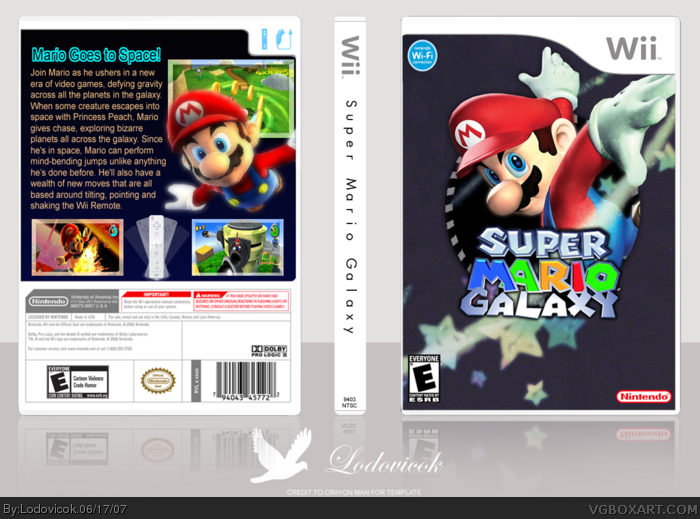
Do not say the pic on the front is overused. Most of the time spent on the box is spent trying to cut mario out...which took alot of skill and effort.
So, yah, this is based on the official sunshine box for Gamecube. If you wan't the new logo, ask me and I'll PM it to you.
i really like this one, it has a nice clean feel to it, its one of the better galaxy boxes for sure, the only thing for me is that the back cover's background is plain black and the text is boring
 Super Mario Galaxy Box Cover Comments
Do not say the pic on the front is overused. Most of the time spent on the box is spent trying to cut mario out...which took alot of skill and effort.
So, yah, this is based on the official sunshine box for Gamecube. If you wan't the new logo, ask me and I'll PM it to you.
Hope you like it.
-Lodovicok :)
[ Reply ]
Very, very cool!
[ Reply ]
i really like this one, it has a nice clean feel to it, its one of the better galaxy boxes for sure, the only thing for me is that the back cover's background is plain black and the text is boring
[ Reply ]
very nice
[ Reply ]
I really like the effects. Nice one.
[ Reply ]