[ Box updated on June 17th, 2007 ] [ original ]
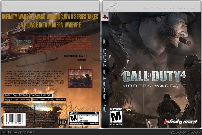
 Call of Duty 4: Modern Warfare Box Cover Comments
Comment on ELCrazy's Call of Duty 4: Modern Warfare Box Art / Cover.
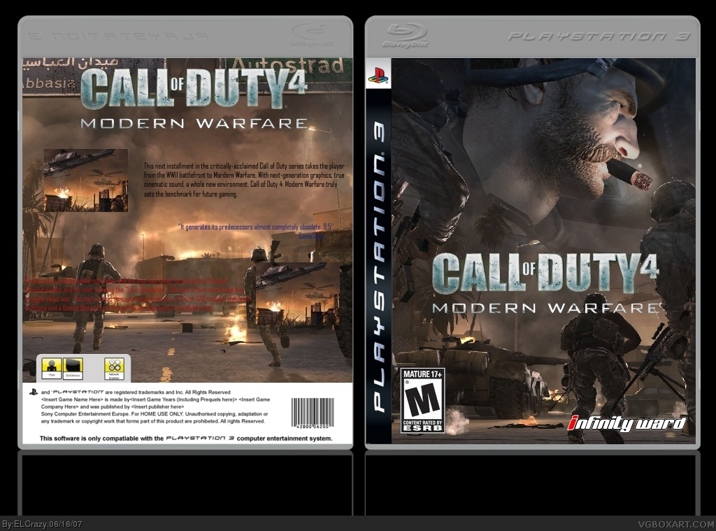
[ Box updated on June 17th, 2007 ] [ original ]
Comment on ELCrazy's Call of Duty 4: Modern Warfare Box Art / Cover.
Your backs are very lackluster but your fronts are very good. ALso, what is up with the reflection. If I were you, I would just keep the front.
[ Reply ]
I agree on my backs being lackluster, but I'm new to making backs, but I'll get the hang of it. :)
[ Reply ]
The front is great, but the back isn't very good. Make your text stand out, don't repeat screens, and give the screens borders. Also, sometimes a cool catchphrase or slogan is better than repeating the title on the back.
[ Reply ]
Thanks for your help. Will improve ASAP.
[ Reply ]
8/10 Pts.
It's a nice Idea and looks Gr8 , but the Letters @ the Back are 2 small ...
[ Reply ]
Updated with a new back.
What'd you guys think?
[ Reply ]
Looks nice , no CoD4-logo @ the Back & New Temp but..
too small ,letters dude
[ Reply ]
Wait... ELCrazy made this? THE ELCrazy?
o___o
[ Reply ]
So this is ElCrazy's stuff back in the day? Even the pros now were beginners then.
[ Reply ]