I have in view of, that colors are over-saturated. Acid. All of them are mixed. And all is somehow glows and blurs. Too most it is possible to notice and in the boxes of Lair, End War, Bioshock. I don't realy like such glow-blur-saturation style. There Is no contrast. Older approach to works is pleasant to me more.
this is pretty damn good but i have a few gripes. i would have liked some sort of explination of the story on the back instead of just explaining how the game pushes the next-gen. Marcus also looks a little blurry on the front but other than that this is brilliant.
I actually don't really like it. Not to be an asshole, but the back is really bad. Its all blury and you picked a horriable choice for the text on the back.
 Gears of War Box Cover Comments
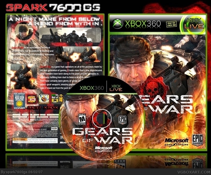
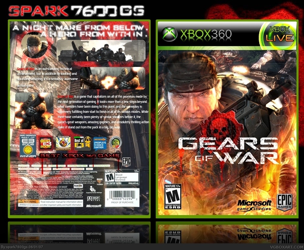
My Gears of war Box.
hope you like it.
[ Reply ]
It's better than the official box.
I'm drooling.
This has got to be my all time favorite Gears of War box EVUR. You rule.
[ Reply ]
It's an excellent boxshot of gears of war , thanks .
[ Reply ]
spark your just getting so good. great job.
[ Reply ]
Too many details o/O
and the text on the back cover is hard readable (
[ Reply ]
holy shit... this is just.... just.... OMG...
#5 stop complaining, your boxes are just the same.
[ Reply ]
This is very very good. It is much better than the outdated original.
[ Reply ]
I have in view of, that colors are over-saturated. Acid. All of them are mixed. And all is somehow glows and blurs. Too most it is possible to notice and in the boxes of Lair, End War, Bioshock. I don't realy like such glow-blur-saturation style. There Is no contrast. Older approach to works is pleasant to me more.
[ Reply ]
#8, Thank you very much Mad Spike.
I'll improve it.
[ Reply ]
this is pretty damn good but i have a few gripes. i would have liked some sort of explination of the story on the back instead of just explaining how the game pushes the next-gen. Marcus also looks a little blurry on the front but other than that this is brilliant.
[ Reply ]
I love the front, but the back looks unprofessional, like you didn't spend enough time on it.
[ Reply ]
I like it .
[ Reply ]
5/5!!
[ Reply ]
I actually don't really like it. Not to be an asshole, but the back is really bad. Its all blury and you picked a horriable choice for the text on the back.
However, the front is really snazzy!
[ Reply ]
yeah. it's cool.. 4/5 the front page is better than the official box... only the back side is a litte strange
[ Reply ]
you can see the sides of your box on the CD.
[ Reply ]
5/5 This is much better than the original Awesome!
[ Reply ]
epic...5/5
[ Reply ]
I give a 5/5 for best gears of war case EVER!!!
[ Reply ]