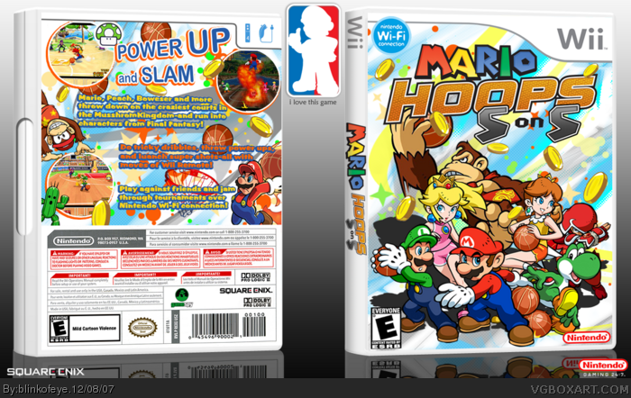
I dont have much time to make boxes right now, i didnt even finished this one, but i thought that it was good enough for posting although i could be wrong. So you guys tell me what you think.
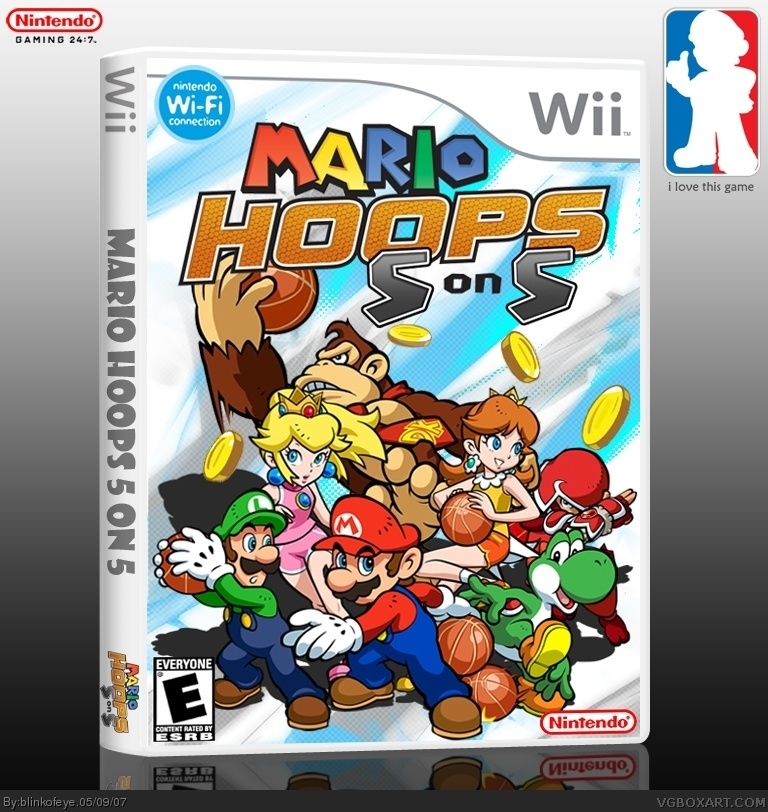
#9, Don't Wii boxes' spines just use Arial-like plain fonts? Maybe it's different in your country. Anyway I'm just saying I would've just gone for an Arial-like font if I ever did something similar.
The front is cool. But the back is awesome. The way the screenshots are in that circle with the orange is good, and the background is really good! You need to teach me some stuff!!!
 Mario Hoops 5 on 5 Box Cover Comments
I dont have much time to make boxes right now, i didnt even finished this one, but i thought that it was good enough for posting although i could be wrong. So you guys tell me what you think.
[ Reply ]
WOW this is awsome!! I Like it^^
4.9/5
[ Reply ]
5-on-5? wow
maybe it would've been simpler if you called it something like "Mario Basketball Tournament"
[ Reply ]
#3, You are right it would probably be called something like that in Europe, but DS game is called Mario Hoops 3 on 3 in USA
[ Reply ]
#4 yeah, i just thought "5-on-5" sounds kinda weird. it's like if you said 10-on-10, it would sounds silly.
[ Reply ]
why not just mario hoops. you dont really need to know how many playes are on a team in the title.
i like it though.
[ Reply ]
This is really good. 5/5
[ Reply ]
I love everything about this box except from the font on the spine.
[ Reply ]
thanks guys, and my dear chap i agree with you about font on spine but bloody hell i couldn't find better font for this game, but i will try.
[ Reply ]
#9, Don't Wii boxes' spines just use Arial-like plain fonts? Maybe it's different in your country. Anyway I'm just saying I would've just gone for an Arial-like font if I ever did something similar.
[ Reply ]
#10, ok i'll do that, thanks
[ Reply ]
I'ts spelled Bowser and Mushroom not Boweser and mussroom, but great anyway.
and take the wi-fi logo down a bit.
[ Reply ]
I'm wet.
[ Reply ]
This looks awesome.
[ Reply ]
I srsly think this might be my favorite box on the site; the colors are so freaking awesome.
[ Reply ]
Like u said 5 on 5 XD
[ Reply ]
Too many characters on the front...
The back was ok thought. Just a little to much text.
[ Reply ]
wifi logo shouldn't overlap the temp
[ Reply ]
The front is cool. But the back is awesome. The way the screenshots are in that circle with the orange is good, and the background is really good! You need to teach me some stuff!!!
[ Reply ]