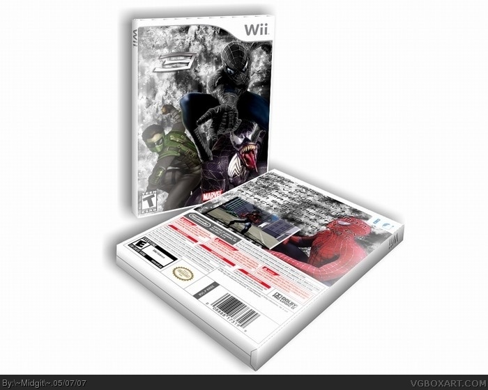
you sohuldnt put the 3d that way, the text is hard to read, theres only one sreenshot, and the front is a bit confusing, the background isnt the best choice either
well first off. T is on the front, and E is on the back. the rendered backgrounds don't look very professional. you also can't read the text on the back.
i can read it. but the back isn't well written anyways. umm you don't finish off evil, these are the beginning of the enemy's. there are about 100 enemy's.
 Spider-Man 3 Box Cover Comments
I like this one. My best yet? CC and ratings please.
[ Reply ]
you sohuldnt put the 3d that way, the text is hard to read, theres only one sreenshot, and the front is a bit confusing, the background isnt the best choice either
[ Reply ]
well first off. T is on the front, and E is on the back. the rendered backgrounds don't look very professional. you also can't read the text on the back.
[ Reply ]
kk I'll fix the 3-d later and the E
[ Reply ]
i can read it. but the back isn't well written anyways. umm you don't finish off evil, these are the beginning of the enemy's. there are about 100 enemy's.
[ Reply ]
Use a different 3D view.
Too cluttered.
[ Reply ]