As I said before "You really need more try,you need send your cover in wip after send to main site" but you listen me, You are not looking for progress . . .
As you said in your last box, good designers are no more present here.and those who are good designers do not support. you're a good designer.you look at yourself, how much you are supporting.
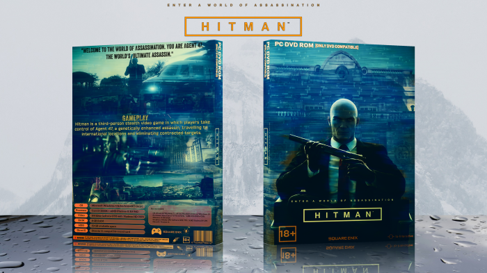
I feel you could add a game summary on the back somewhere, like 3 lines or so. Maybe move the tag line up a little bit and add summary just under it.
Only other bit of feedback is I'd extend the screenshots on the back to go off the side all the way to the spine (not wrapping round the spine though). Just seems a bit plonked on.
Honestly not too much of a fan of the back, some more text wouldn't hurt a little to fill in the space under and over the screenshots. Speaking of screenshots, I'm also not too keen about the one awkwardly angled, keep it symmetrical to the other one in my opnion.
The front is pretty clean though, otherwise a decent box. I suggest to look back at your Watch Dogs 2 box, I think you did an overall clean job with that, especially the back and how you utilized most of the empty spaces (though typography could do some work on that).
personally talking nothing about you or other artists .
some other owners stole the covers and took the credit out of it.
my 2 foreign legion covers where stole .
 Hitman Box Cover Comments
not bad , but very blur
[ Reply ]
should i update.
[ Reply ]
COOL !
[ Reply ]
MOOL :| :!
[ Reply ]
@matingsm what :| ?
[ Reply ]
@matingsm BTW do some tutorials 2
[ Reply ]
thanks.
[ Reply ]
As I said before "You really need more try,you need send your cover in wip after send to main site" but you listen me, You are not looking for progress . . .
[ Reply ]
As you said in your last box, good designers are no more present here.and those who are good designers do not support. you're a good designer.you look at yourself, how much you are supporting.
[ Reply ]
@Thegamer pm me in privet
[ Reply ]
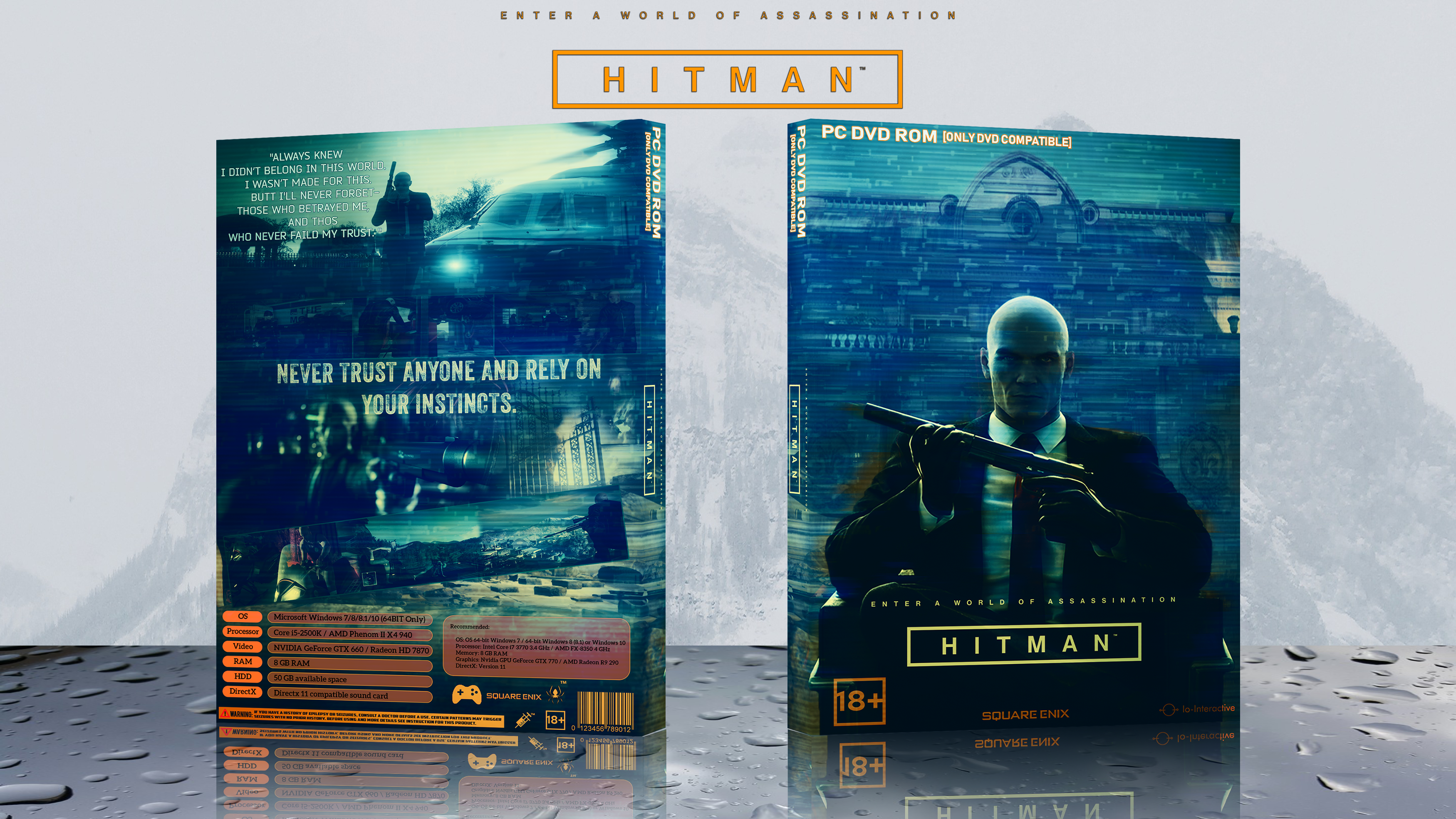
I really like this, your best case so far imo.
I feel you could add a game summary on the back somewhere, like 3 lines or so. Maybe move the tag line up a little bit and add summary just under it.
Only other bit of feedback is I'd extend the screenshots on the back to go off the side all the way to the spine (not wrapping round the spine though). Just seems a bit plonked on.
[ Reply ]
thanks and updated.
[ Reply ]
Honestly not too much of a fan of the back, some more text wouldn't hurt a little to fill in the space under and over the screenshots. Speaking of screenshots, I'm also not too keen about the one awkwardly angled, keep it symmetrical to the other one in my opnion.
The front is pretty clean though, otherwise a decent box. I suggest to look back at your Watch Dogs 2 box, I think you did an overall clean job with that, especially the back and how you utilized most of the empty spaces (though typography could do some work on that).
[ Reply ]
thanks and updated.
[ Reply ]
plz for all pepoel Printable
[ Reply ]
personally talking nothing about you or other artists .
some other owners stole the covers and took the credit out of it.
my 2 foreign legion covers where stole .
[ Reply ]