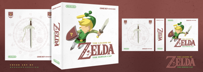
Wanting to keep up my momentum from my Castlevania: Symphony of the Night cover, I wanted to create another minimal/less-is-more kind of style.
I think people will either love or hate this one, but anyway, I do hope you like it. I also didn't know what presentation to do; 2D or 3D, so have both just because haha.
 The Legend of Zelda: The Minish Cap Box Cover Comments
Comment on BenBrownDesign's The Legend of Zelda: The Minish Cap Box Art / Cover.

It's not bad. I have nothing against the "minimalist" approach, if you want to call it that, though I never really understood the lack of facial features on a partly rendered body. I can't really blame you, as a lot of popular boxes did this, but to me, personally, it looks unfinished. Especially when it's all you are focusing on.
The back is cool. I would like it if the pattern on the back where more defined, but I feel if you would have kept that theme of ornate imagery throughout the whole design, you would have some sort of temple of time atmosphere. Or whatever the Minish Cap equivalent is
Like I said, it's not bad, I just don't think the ornate look of the back, and the graffiti look of the front mix.
[ Reply ]
I actually like the ornate back myself, though I do have to say I would have liked some kind of facial features or something on his face just because of the fact that it seems it would be a lot more balanced overall with it.
Overall though, great choice of color use. I like the white you have used and the fact that you made it a much more effective minimal take.
[ Reply ]
V pretty.
[ Reply ]
I dont know if im a fan of the fact that he doesn't have eyes.
Whatever, fav's are free to give out.
[ Reply ]
question: where did you get the resourses ? you made them or you find them ? beacuse people make some of these cover ( in this style) and i LOVE EM ! the cartoonic style is atractive for me ! idkw xD
[ Reply ]
link
link
[ Reply ]
@Sonic the Hedgehog That's not where I got the resources from, haha.
[ Reply ]
@Sonic the Hedgehog i have find them om g-image but this one is cartoonic not something with textures or patterns (flat)
[ Reply ]
@CPT_KASRA I imagine, he had a initial picture from the game as a reference and then made his version in illustrator. He could have carried on with it and added more detail, but the less detail give it, it's flat look.
[ Reply ]