when Nintendo and Sony collide!
 Dragon Ball Super Mario Strikers 64 Box Cover Comments
Comment on skellydude's Dragon Ball Super Mario Strikers 64 Box Art / Cover.

when Nintendo and Sony collide!
Comment on skellydude's Dragon Ball Super Mario Strikers 64 Box Art / Cover.
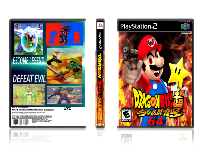
The cover shows reverse Mario (not WARIO!)
[ Reply ]
This is a complete mess. Dont get me wrong, its not the idea. Just, It looks bad.
First, the template. WHAT? Decide what console to do it for! You have playstation 2, nintendo 64, AND DVD. Choose one,
Second, the logo. Its just the dragon ball super and super mario strikers logo with a 64 under it. Try to be more original.
The front of the cover, well personally I dont like the idea, but its still a cover so ill be as objective as possible, The edits look, well, at least decent, and thats saying a lot. It was obviously done with paint. The hand with the gun is actually not bad, the eyes are decent too. The W on marios hat looks bad, and his eyebrows are not drawn well. His mouth lacks detail too. And the star, well, its not bad, but it looks out of place. Try to make it darker.
The spine, well... it has one problem. Keep the title consistent. In the front it says dragon ball super super mario strikers 64, and the spine says dragon ball plus mario. Even in the title here you didnt put the word super.
The back is really bad. It does not fit with the front and has a lot of problems. First, about the text... Become legend? Thats not even a sentence! And you should add more text, like a brief description of the game or story.. Now, the images are stretched, which is also bad. You should also make them a bit smaller and add some borders.
That is basically it, it has some more minor problems but thats all Im gonna point out. Please keep in mind im not discouraging you from doing covers, keep on doing more! Just try to fix the mistakes. Also, I reccomend you use photoshop or gimp. Looking forward to your next cover, I hope you make an awesome one!
[ Reply ]
Oh no lol
[ Reply ]