Experience the classic 'Smackdown!' series of games like never before! From 'Smackdown!' on the Playstation 1 to 'Smackdown! Here Comes The Pain' on Playstation 2 and everything inbetween, you'll get to experience the great arcade-like gameplay paired with modern day graphics.
Update: I've added a JPEG printable download and I have taken the suggestions and done most of them, general clean up with little things that most people didn't notice either ;)
[ Box updated on August 7th, 2017 ] [ original ]
 WWE Smackdown! Remastered Box Cover Comments
Comment on olikidsley's WWE Smackdown! Remastered Box Art / Cover.
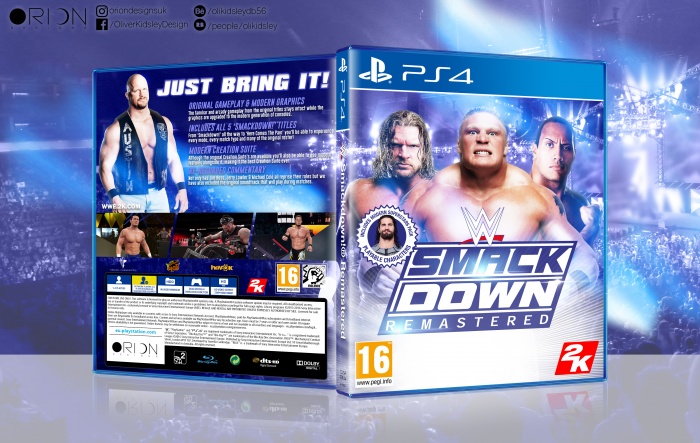
Well done! I really like the adoption of the classic characteristics there are to Smackdown!. You've really captured the essence of the franchise well. I think there could be a few changes attributed to this design though, as I'll state to follow:
The text on the back is not aligned with the description text, given that Stone Cold is sort of the reference image... you could have either added tilted lines to separate them (to make the orientation make sense, if you wish to keep it) or tilted it to make it match the rest of the description text.
The screenshots can also use some treatment, like some kind of [white] stroke to add to the vibe of it. As a new member though, this is pretty darn sick.
[ Reply ]
Hey, thanks for the feedback!
I agree with you on both, I was using the current WWE 2K games as a reference for the back and to me it didn't look like the screenshots had any effects on them but on a second glance they really stand out. I tilted the 'Just Bring It!' because I thought that maybe the back needed to look a bit more dynamic but I can see that it looks a bit odd.
Thanks a lot though, I had all my smackdown games out and referencing the covers constantly during the making of the front cover, I really wanted to make sure it looked like it was from the same series and I'm really happy with the result.
[ Reply ]
@olikidsley Yeah, I can see you attributed a lot of what I said into the cover, and now its more cohesive as ever. You've really accomplished what you meant to here, and I'm glad to say it became a solid design. Well done.
[ Reply ]
i really don't like the idea of not giving us a printable, man this shit is so well made, its a shame i cant print one :(
[ Reply ]
@DeltaKrew I can add a printable, I wanted to see if anyone wanted one first haha
[ Reply ]
The front looks really sharp (I especially like the color scheme, the logo and lens flares) and the back is well organized.
The summary text and tagline would be nicer, if aligned at the same angle as the logo or screens (which makes it feel more dynamic as a whole) and (as already mentioned) the screenshots could benefit from some kind of white toned borders (maybe add some small lens flares, around the edges of the borders?)
Nice job nonetheless.
[ Reply ]
Really like the lighting effects on the front, it gives the case a real pop. I'm liking the advertisement quality of the back, but it doesn't have quite the same pop as the front. Maybe if Austin was in a wrestling pose/ looked a bit angrier, if you know what I mean, that might help.
[ Reply ]
Good job
[ Reply ]
Yes! Yes! Yes! I would definitely buy this if were real! Well done!!
[ Reply ]