![]() »
»
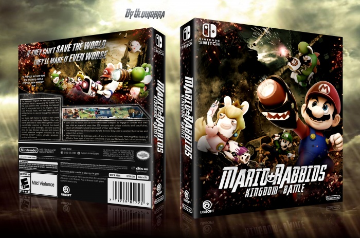
BE CAREFUL THIS BOX IS DARK. IT IS SO DARK THAT IT MAY STEAL YOUR SOUL OR EVEN WORSE, SCARE YOU THE WHOLE NIGHT.
When the game was announced I was like “please cancel that shit” and when I saw the gameplay trailer, well I thought this game could be interesting after all. I made the front a few days ago for fun (on deviantart) and I thought it could be fun enough for a box. So I just made the back today also to make a break in the creation of the Jojo box (any help on the wip section is wellcomed btw o/).
And I know that the dark/serious atmosphere doesn’t fit the game, that’s the box’s purpose.
So if you have constructive feedbacks about it, don’t hesitate to share it.
Also thanks to iman_pro for the template.
 Mario + Rabbids: Kingdom Battle Box Cover Comments
Comment on Ulquiorra's Mario + Rabbids: Kingdom Battle Box Art / Cover.
I truly can't stand those rabbids to be honest, but the dark tone on this box, actually makes them a bit more bearable.
[ Reply ]
The fact that the box is silent and can't scream may also help.
[ Reply ]
@Ulquiorra that still can't help when looking at those awful goofy rabbid eyeballs (they truly freak me the hell out)
[ Reply ]
@Bastart Heh, you've got a point.
[ Reply ]
If the game was actually like this, it would make more sense. After all, it IS ubisoft. But for real, Amazing cover!
[ Reply ]
Thanks!
[ Reply ]
haha this is awesome! if the game was actually like this i wouldn't hate it because you made it look like something actually decent. great work!
[ Reply ]
I don't think making this game more serious would make it more decent :/
Thanks for the kind words!
[ Reply ]
Maybe have it in humour since the gears of war style is funny.
[ Reply ]
After all, Gears of war is well known as most hilarious game ever.
[ Reply ]
@Ulquiorra I meant it's funny using that GRIM DARK style for Mario :) But I like it that way.
[ Reply ]
Dang that tagline could be so much larger but at the same time, it's too creative to bypass. Nice job.
[ Reply ]
Thanks! Concerning the tagline, I tried to make it larger but to be honnest I felt that it took too much place :/
[ Reply ]
I think that game not gonna be fun for me, Awesome job Love the avengers style you did on Mario and Rabbids it was smart idea.
[ Reply ]
All games can't be fun for everyone^^ Thanks!
[ Reply ]
again again again and again dark design , not good , and not use credit for render
[ Reply ]
This . . .
[ Reply ]
The renders were found on here: link
And if you don't like dark design, that doesn't make it a bad box, that only makes it a box you don't like. If the only reproach you've found is "too dark", then that means there isn't much thing to say. You should take notes from others members about what "constructive" means.
[ Reply ]
And don't ask for credits. Have a look here: link
See? If I compare with the resources matingsm submitted, I started my box before he add the renders on the site's section. To be more easy to understand, I didn't use theses.
[ Reply ]
And you know what? I'm such a nice guy that I'll give you the links of all my "not that dark boxes" that it seems you didn't like that much anyway.
link link
link
link
link
link
link
link
link
link
link
link
link
link
link
link
link
link
link
link
link
link
link
link
link
link
So is it really a matter of dark color or is it just that you're looking for random stuff to reproach?
[ Reply ]
@Ulquiorra lol Why you burning now? It was just a Criticism. You could say easily" it were my own opinion " , But imo it is not good enough for a designer in 49 level here.
about your second comment I need to tell somethings
first : you uploaded 163 covers and you gave 26 link of your Bright designs so you accepted that your most box are dark
second : about likes
it been long time since you and your friend decided to ingore our works even if they was good
also I give you a design idea no more, may many of you don't accept my designs but my idea is you using tools very well but too dark and thats not good.
[ Reply ]
@shiraziha You know the difference between a constructive criticism and an opinion? Right?
"This box is dark", it's an opinion. You can have one, but keeping repeating that is completly useless and boring.
"This box is dark and so is the title, that's a problem because we can't see the title", it's a constructive criticism.
And yes, most of my boxes are dark because, guess what, that's what I like to do. I've already said that btw ( link ) but it seems that your remembrance skills aren't that good.
So the only thing you reproach to this box is personal. Personal taste does nothing with "good".
And I'm not blaming you for not liking my work (actually I don't give a shit), I'm blaming you for saying that you don't like dark stuff and then ignoring what isn't part of that stuff. There's a word for that: "hypocrisy".
So next time, if the only thing you can say is "too dark", well I tell you right now, it's useless for me and you.
[ Reply ]
@matingsm Right now I'm laughing SO HARD. You know that you aren't the only ones who don't always like my boxes don't you? Martiniii, Lucidhalos, Bastart, FrankBedbroken they gave me advice that helped to improve myself. Last exemple: my godzilla vs kong box. You were like "too dark", thanks, that's not a way to help. They gave me more precise details and more important, they did helped me when I wanted to improve the box by fixing what could be fix.
And don't begin to try a comparison when I look on your boxes, I only see "good work bro", "awesome man" or "love it": that's some constructive shit. I don't know concerning others so I'll just speak for myself: I don't fave a box because it's one of my friends or not. I only fave box that I like.
And one last thing: I'm jealous of people who do job that impress me and that I wish I would have has much skill as them. I'm jealous of YoshiStar, Martiniii, Aldimon. But I'm not jealouss of you, sorry.
[ Reply ]
@matingsm If I'm just an ordinary nasty bad member why wasting your time with me? You make no sense.
Yes I ignore you because, plot twist, I don't like you. I'm honnest as youy asked: I don't like you. And to be even more honnest, when I don't like someone I don't go on his box saying tones of bullshit.
[ Reply ]
@matingsm I'm burning so hard booooo. You make me sooo sad :"(
[ Reply ]
Besides "now you're Burned and destroyed". You do realize that you're just talking about a website account right?
[ Reply ]
@Ulquiorra This discussion can go on for days, is it really worth it?
[ Reply ]
@Bastart Nah you're right.
[ Reply ]
Nice idea like the organisation of the front
[ Reply ]
Thanks o/
[ Reply ]
This is pretty cool. While the palette isn't very Nintendo-esque, it definitely fits the grittier theme they seem to be wanting to do with the game. The contrast of lights and shadows is done really well on the front and on the back in most places (Peach and Luigi Rabbid looks a tad too bright, but I also noted the quality of those two is less than the others—not a big deal).
The organization of the content on the back is done pretty swell. It's a bit text heavy, but it's legible and information is broken down nicely. Good stuff.
[ Reply ]
Thanks lucid! :D
[ Reply ]
Love it!
[ Reply ]
Thanks!
[ Reply ]
DOPE! Love it, great stuff
[ Reply ]
Thanks!
[ Reply ]
Damn ! its perfect
[ Reply ]