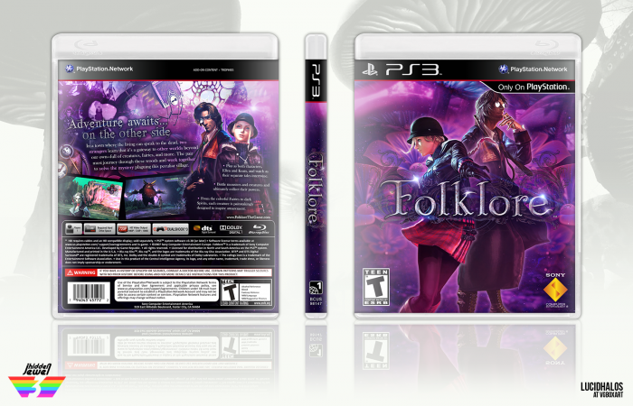
Hey guys, so I decided to get my butt up and do a box for the hidden jewel competition. There have been so many great submissions so far—good luck to everyone!
Anyway, I decided to pick the purple group, even though there are bits of pink and blue in it too. This game is a bit of an underated gem, that I never had the chance to play myself but have always wanted to. Finding good resources to work from was hard, but I managed.
Thanks again to everyone who helped in the WIP forum, especially Sarashi, who provided me with some nice resources to finish this off.
Sorry for the reupload. I had to resumbit this because the updates were not applying and it was driving me insane. I just tweaked the text a bit. Felt like it was a bit too small, so jumped the scale up a bit and shifted things accordingly.
 Folklore Box Cover Comments
Comment on lucidhalos's Folklore Box Art / Cover.

I really love this. I'm thinking that the very top of the back feels a little empty compared to the rest, though I don't quite know what you'd fill it up with due to the lack of resources.
Great work! :)
[ Reply ]
Well, I didn't want to overwhelm it either. I tried to keep the top half of it a bit more subtle with background images instead.
[ Reply ]
This is great I love the colours
[ Reply ]
Thanks! Purple's a fun color.
[ Reply ]
I really like the purple color scheme, lightning spots on the title and the layout overall is really clean. The sharpness in full view gets a bit lost, not that big of a deal though (is it due the upscale of the text?)
I don't why but I got a Trine/Alice Madness feel from this box?
[ Reply ]
It's due to the quality of the sources more so. The images were sometimes a bit low-quality and I was forced to work at 150dpi as opposed to 300dpi. The text is the only thing I enlarged in the update since I keep my psd files…although the file is massive at 200+ layers.
I can see it. I actually have Alice, the movie, resources in the background for some pop. The game is a fantasy one, so it may give off those vibes.
[ Reply ]
This is really, REALLY good. I was waiting fort this one. It would've been cool to see those shines on the logo on the back tagline but it's not a diminishing factor. Awesome job lucid.
[ Reply ]
Thank you! I was considering doing that, but I thought I would overkill it, due to the fact I decided to do that on the key. I have a bit of a lighting effect on the text to try and bring some depth.
[ Reply ]
@lucidhalos Ah I actually didn't see that before. So it equalizes well. Very nice.
[ Reply ]
As ever, the lighting in your box is really good, and the purple gives a real nice fantasy feel.
[ Reply ]
Thanks and also thank you again for the resources. If it wasn't for it, I don't think I would have been able to complete it the way I wanted to.
[ Reply ]
@lucidhalos No problem, I had just happened to spot them while searching these sites anyway so it was a happy coincidence.
[ Reply ]
oh my god! printable please!!!!!
[ Reply ]
It's been added.
[ Reply ]
Congrats Lucid! This is really well deserved. :)
[ Reply ]
Yeah congratz my girl
[ Reply ]
Huge congratulations! :D
[ Reply ]
Amazing!! Congrats!
[ Reply ]
Thanks everyone!
[ Reply ]
Great use of colors. Great organization of the back. Great box overall. Fav.
[ Reply ]
Back is really cool. Nice work. Congrats <3
[ Reply ]
Hello guy. I like your box arts and want to buy few. I need to make some arts for psn games on ps4 (outlast, tricky towers, rocket league) and other only psn games). I want to print it and use in my boxes collection. Lets write me on my email: [email protected]
I will pay you for every art. Plese, i need you.
[ Reply ]
Sorry, I don't really have the time to do requests—especially due to school and work. I do these at whim whenever the mood strikes and not for profit considering resources are a majority of the time not my own.
Good luck on your search.
[ Reply ]
That's gorgeous!
[ Reply ]