@Vince_1990
I think the reason is that we expect the usual icons and normal style . I agree space on width and height , which causes hardening of the design. But during design, its hardness is reduced and many options at our disposal .(excuse me for speak poor English . I use google translate.)
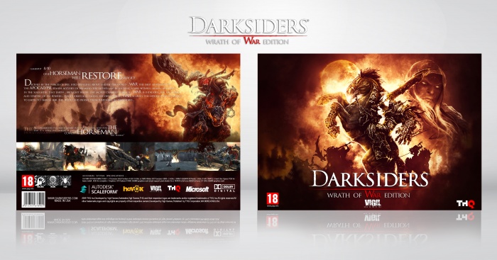
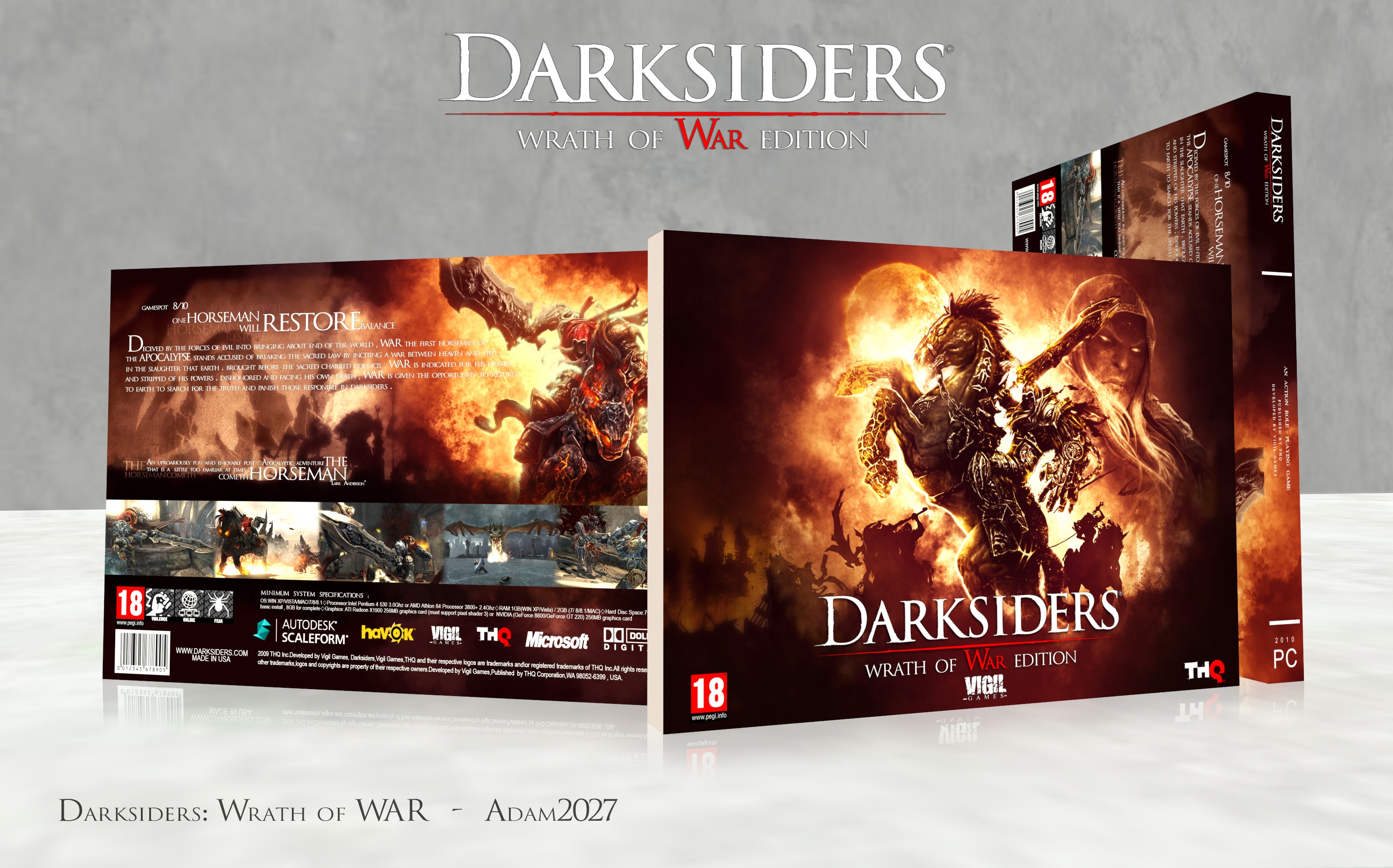
Generally, horizontal boxes don't work that well due to the long running text that generally happens with the back of it. On top of that, boxes are made to be vertical in order to fit better on a shelf.
Personally, I don't have much of an issue if these things are noted and executed well. You broke the text up nicely and the front of this looks really lovely. It's interesting and I do like the fact you took into factor the placement of your spine—otherwise it would read like an artbook with a landscape orientation.
 Darksiders: Wrath of War Box Cover Comments
dont really like these sideways style designs... I feel having them the normal way up would make it much stronger.
[ Reply ]
tnx for comment my friend.I try to design better cover.but one question.why people dont like this style?Is it really worse?
[ Reply ]
@Adam2027 I dont really know why i dont like it.... Things looks too cramped height wise and loads or space on the width.
[ Reply ]
@Vince_1990
I think the reason is that we expect the usual icons and normal style . I agree space on width and height , which causes hardening of the design. But during design, its hardness is reduced and many options at our disposal .(excuse me for speak poor English . I use google translate.)
[ Reply ]
Generally, horizontal boxes don't work that well due to the long running text that generally happens with the back of it. On top of that, boxes are made to be vertical in order to fit better on a shelf.
Personally, I don't have much of an issue if these things are noted and executed well. You broke the text up nicely and the front of this looks really lovely. It's interesting and I do like the fact you took into factor the placement of your spine—otherwise it would read like an artbook with a landscape orientation.
[ Reply ]
Tnx for comment my friend <3 .
I agree. but,This style has its own beauty.Exactly more space on back. you can work more on back with more space.
[ Reply ]