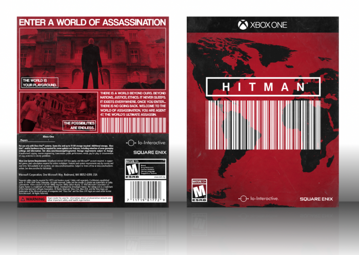
I really like the front, but I think like the back could use some work, specifically the text, I'd say a non all-caps, maybe a thinner font should work better for the synopsis text (though, I know working with text on Paint.NET is quite annoying, specially after you get accostumed to using Photoshop), and the placement of the smaller screenshot feels a bit off, in my opinion, though you don't really have much options when it comes to structure there. I also feel like it could use a bit more black, aside from the template. Still, I like it. :)
 Hitman Box Cover Comments
I really like the front, but I think like the back could use some work, specifically the text, I'd say a non all-caps, maybe a thinner font should work better for the synopsis text (though, I know working with text on Paint.NET is quite annoying, specially after you get accostumed to using Photoshop), and the placement of the smaller screenshot feels a bit off, in my opinion, though you don't really have much options when it comes to structure there. I also feel like it could use a bit more black, aside from the template. Still, I like it. :)
[ Reply ]
Agreed ^
[ Reply ]
I feel like in a professional setting, all red screenshots will not fly. Other than that, good work!
[ Reply ]
Actually personally I'd think it'd look BETTER with proper screenshots since it'd make the composition look more lively!
[ Reply ]
noice
[ Reply ]
ESRB should start using transparent logos they look great...especially in this
[ Reply ]