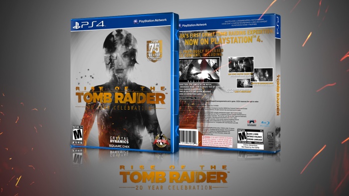
I tried to maintain the official cover feel to it while making my own adaptations. I've always liked gold textures and that kind of double exposition look. So, I merged those two in one thing and got this.
 Rise of the Tomb Raider: 20 Year Celebration Box Cover Comments
Comment on Capricorn_Inc's Rise of the Tomb Raider: 20 Year Celebration Box Art / Cover.
I LOVE the front, but the back isn't up to the same standard in my opinion. The structure seems odd to me, like, the cover seems jam-packed on the left but really empty on the right. Aside from that, really great design, an impressive one for your first cover! Welcome to the site. :)
[ Reply ]
Thnks for your opinion! And yes, I agree with that. I wasn't shure about the back either so I just... let it as it was. lol
But I find pretty good for the first try.
[ Reply ]
Gotta agree with the TR expert here, this has the potential of looking really good as a whole, but the back lets it down a bit, I would try a simpler layout with Lara's head taking up space on the left, and use the right part to put on the tagline, screenshots and such. That being said, it's a nice first box. Welcome to VGBA, hope you enjoy your stay! :)
[ Reply ]
@FrankBedbroken Thanks, man!
[ Reply ]
@Capricorn_Inc Good job
[ Reply ]
@Capricorn_Inc I agree with TR and Frankie
[ Reply ]
The front looks nice, the back looks unfinished though.
[ Reply ]
beautiful
[ Reply ]