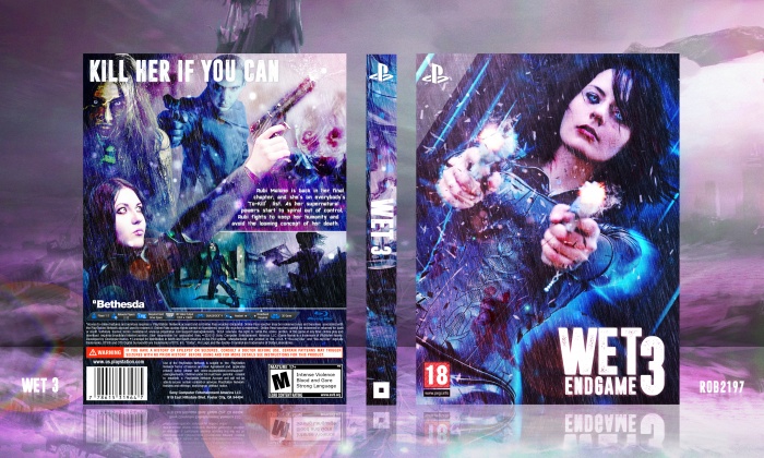
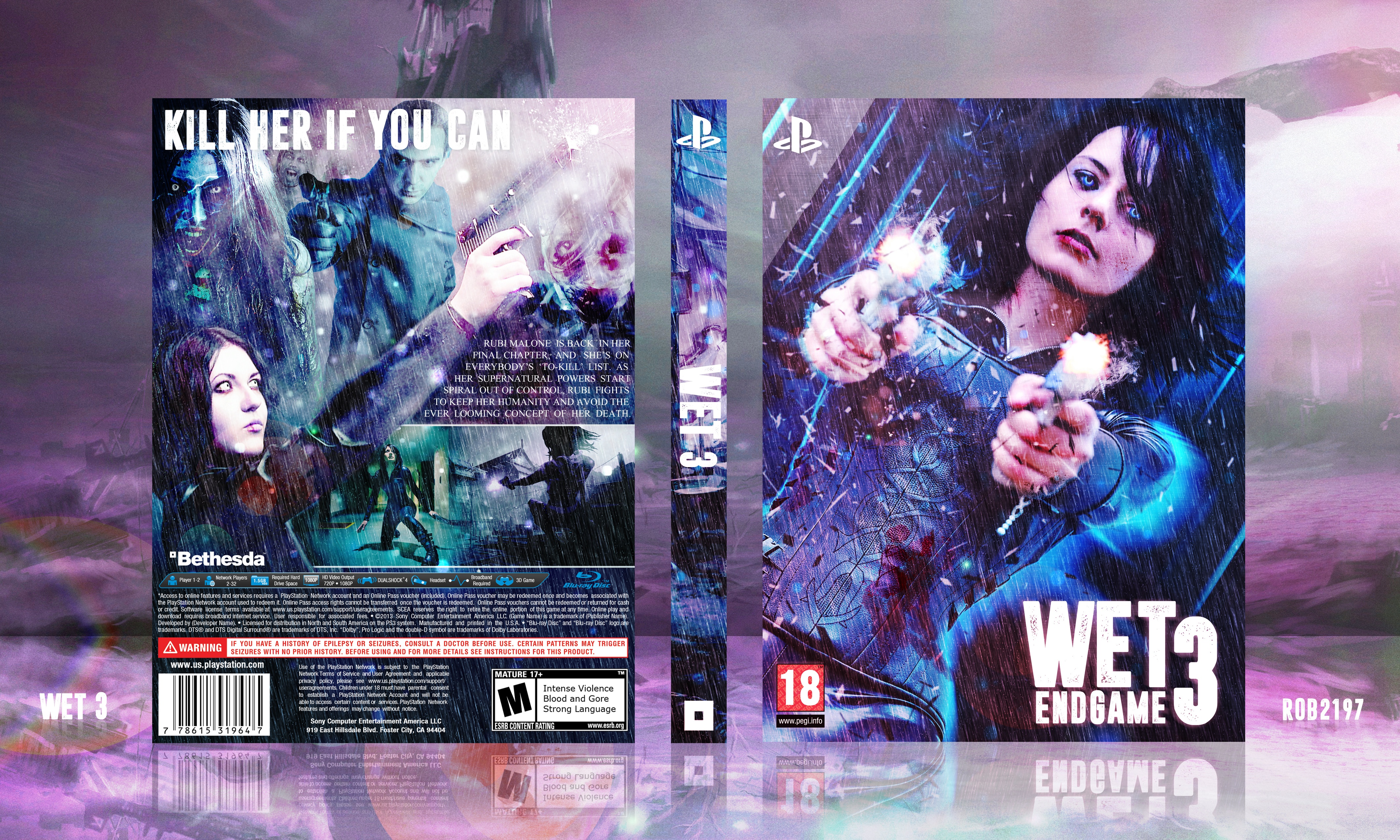
So this is basically a sequel to an old box of mine that I did for the Stand Alone Sequel Competition. I enjoyed making that so now I've ended up making another for it.
My WET 2 box for reference: link
This box higher resolution: link
Credit to Cosplay artist - link
[ Box updated on April 9th, 2016 ] [ original ]
 WET 3 Box Cover Comments
Comment on rob2197's WET 3 Box Art / Cover.
It's sick, I especially like the front. My suggestion for this and future designs is to watch for how the colors blend, for the back especially, it makes the depth hard to decipher and interferes the viewer's focal attention (e.g. between Rubi and the zombie girl on the back), and her gun kinda disappears behind a flurry of colors. I'd watch out for that. Other than that it's cool.
[ Reply ]
The front is wicked, but the back needs some fixing. The composition is a bit weird and the summary text looks slapped on (that font in all caps is also very painful to look at it). It looks cool nonetheless and I do love the colors.
[ Reply ]
Thanks for the feedback guys.
[ Reply ]
The front is fantastic, but I agree with Lucid about the back. The general layout seems really odd. Nonetheless, it's a great box!
[ Reply ]
Amazing
[ Reply ]
Will be updating soon with some changes to the back.
[ Reply ]
Great work Rob, you have done well to make a series of something that don't exist.very nice!
[ Reply ]
I think the back would look a lot better if it had more "gameplay" squares. It feels kind of empty without that.
The front is of course perfect.
[ Reply ]
very nice lovely colours dude
[ Reply ]
Updated - New High Res - link
[ Reply ]
Nice use of colours overall. I’m really digging the colour scheme that you have going here, but the back is still lacking. The tagline looks unoriginal, and its placement makes the overall design on the back seem rather ‘awkward’ considering how much of the content on the back, such as the screenshots and the synopsis you have, are placed towards the bottom. There’s too much empty space between the tagline and the screenshots/synopsis; I do understand you have a little ensemble going with all the characters (it does look nice), but seeing all the space that could’ve been used more effectively still makes me wonder why you’ve decided to squeeze the synopsis in such a little space. I would suggest removing some of the characters on the back, and going for a more simplistic look which gives you more creative freedom instead of keeping the design cluttered, and looking rather unoriginal as a result of the design choice that you’ve made with all the character renders and such. Other than that, the cover is great. I just feel as if the back doesn’t supplement the awesome design you have going on the front.
[ Reply ]
Thanks for the feedback.
[ Reply ]