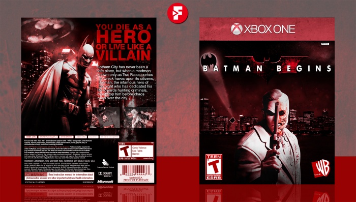
New box!
So, this is my design for the Midas Touch comp this year, in which I was told to remake this box: link by GameBoy64, and to be quite honest I wasn't really sure if I dug the look I was making, but as of now, I'm fairly content with it. Yeah, it's definitely not the best, but it's... something, I suppose. Also, I'm heading up against Higashi89 so haha my ass is gonna be in a silver platter when this is over. On a side note, this is my 50th box on this site, I definitely cannot thank you guys enough for helping me come this far here, you are awesome! :)
Anyways, as always, constructive criticism is welcome, and huge thanks to lucidhalos, CAMWIN, Paper and GameBoy64 for their help and feedback in the forums, it's greatly appreciated. Also, credit to Titan38 for the ESRB's, tomB for the Xbox Template, TwistRox for the Batman logo, and mark_inou for the renders.
Hope you guys like it! :D
 Batman Begins: The Game Box Cover Comments
Comment on FrankBedbroken's Batman Begins: The Game Box Art / Cover.

I think this turned out quite awesome. :)
[ Reply ]
Thanks, lucid! :D
[ Reply ]
It's fine. Faithful to the original in most aspects. And congratulations on it being your 50th box art!
[ Reply ]
Thanks, Alex! Good luck on your entry as well! :D
[ Reply ]
This looks pretty great. It's definitely an improvement on the original.
[ Reply ]
Thanks, man! :D
[ Reply ]
Amazing work. You did a fine job fixing my old mess.
[ Reply ]
Thanks, man! :D
[ Reply ]
what is it...........?????????????????????????
[ Reply ]
ayyyy lmao
[ Reply ]
Perfected.
[ Reply ]
Thanks, man! :D
[ Reply ]
you did it well
[ Reply ]
Thanks, man! :D
[ Reply ]
looks nice frank
but, I think you could have made even better according to your other works
[ Reply ]
To be honest, I can say this is not one of my best, but I believe it does the job fine. Still though, thanks for the feedback. :D
[ Reply ]
That back looks fantastic! The front is pretty good too
[ Reply ]
Thanks, Steve! :D
[ Reply ]
Nice work
[ Reply ]
Thanks, man! :D
[ Reply ]
I somehow missed this. Great job on this Franco, it's very faithful to the original design :)
[ Reply ]
Thanks, Nathan! :D
[ Reply ]
I like the direction you took, the back text clashes a little in places with the brighter colours but overall it's pretty daammmn cool.
[ Reply ]
Thanks, Rob! I was kinda unsure about the text, because in which ever color I used it clashed with the background, and just ended up settling with this one, which was the one that clashed less. :D
[ Reply ]
Nice
[ Reply ]
Thanks, man! :D
[ Reply ]
Awesome work Frank, like normal. I love this
[ Reply ]
Thanks, Vince! :D
[ Reply ]
I want collaboration with you
[ Reply ]
Congrats Franks, well deserved. I really like this design
[ Reply ]
Thanks, Vince! :D
[ Reply ]
why tho
[ Reply ]
Congrats on HoF, Frank!
[ Reply ]
Thanks, man! :D
[ Reply ]