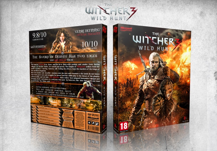
I would say the back is a bit lacking... It seems a bit text heavy, the Red words are not the easiest to read and the overall layout seems a bit rushed.
Ohhhhh fuck yeah that front man love it. I agree with Vince that the back is a bit lacklustre in comparison though. Changing how much text there is in the central area would improve it a ton.
 The Witcher 3: Wild Hunt Box Cover Comments
Nice work Ajay, I love the front, really nice.
I would say the back is a bit lacking... It seems a bit text heavy, the Red words are not the easiest to read and the overall layout seems a bit rushed.
[ Reply ]
Oh thanks Vince maybe text little heavy but if see in full size red words
Easy read and thanks Vince ;)
[ Reply ]
Perfectly
I like this design
[ Reply ]
Thanks ;)
[ Reply ]
front - very nice ! Back - too simple for me. Overal good job !
[ Reply ]
Thanks Dante ;)
[ Reply ]
Ohhhhh fuck yeah that front man love it. I agree with Vince that the back is a bit lacklustre in comparison though. Changing how much text there is in the central area would improve it a ton.
[ Reply ]
Thanks for feedback ;)
[ Reply ]
great
[ Reply ]
Thanks ;)
[ Reply ]
very impressive
[ Reply ]
Thanks ;)
[ Reply ]
it's very nice
[ Reply ]
Thanks ;)
[ Reply ]
Good Job But I think you must change the fonts on back dude
[ Reply ]
Thanks man ;)
[ Reply ]