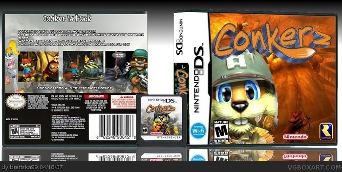
hey i tried, nobody would make me a logo i asked 3 times and no one would do it so i made my own it sucks it looks like conker z but anyways, credit to blink of eye for the temps
i was always wondering how the hell some of you make my temp so choppy considering that when i posted temps they were sharp, anyway the logo is very good but make "2" two times bigger and maybe some other font and little less choppy. And you dont have to ask for logo if you already know how to make one, cos this one is good
Not bad I like it, but the conker logo is too choppy, the back is dull, the font is hard to read, and the cut out of conker on the front is really choppy
 Conker 2 Box Cover Comments
hey i tried, nobody would make me a logo i asked 3 times and no one would do it so i made my own it sucks it looks like conker z but anyways, credit to blink of eye for the temps
[ Reply ]
nice, .::mauro::. likey!
[ Reply ]
#2, thanks, and sorry for die hard conker fans for making a bad box :( i tried
[ Reply ]
i was always wondering how the hell some of you make my temp so choppy considering that when i posted temps they were sharp, anyway the logo is very good but make "2" two times bigger and maybe some other font and little less choppy. And you dont have to ask for logo if you already know how to make one, cos this one is good
[ Reply ]
i like it but its pixalated and the font isnt a good one to use.
[ Reply ]
yeah i don't know why its pixalated
[ Reply ]
#4, maybe its all choppy cause we use photoshop and use gimp
[ Reply ]
good box, i have to admit. i hate conker though. still, great box.
4/5
[ Reply ]
#8, thanks and why do you hate conker so much?
[ Reply ]
if this game comes out i buy it
[ Reply ]
Not bad I like it, but the conker logo is too choppy, the back is dull, the font is hard to read, and the cut out of conker on the front is really choppy
3.7/5
[ Reply ]