Hey!
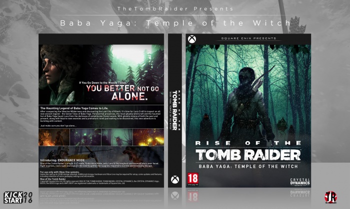
Here's my Kickstart box.
Yes. Yes I am using the DLC for Rise of the Tomb Raider as an excuse to make another cover for it. Since I'm so stuck for ideas, I figured I might as well.
I'm aware, due to the same template, it's a little similar to my previous ROTTR cover - that's okay as I intended it to be the box for the DLC counterpart (if the two were released together).
Thanks for looking, and as always, constructive criticism is always appreciated! :)
Avoid the ugly VGBA .jpg by checking out this much sexier version: link
 ROTTR - Baba Yaga: Temple of the Witch Box Cover Comments
Comment on TheTombRaider's ROTTR - Baba Yaga: Temple of the Witch Box Art / Cover.

Dayum, it uploaded in literal seconds, did Reed actually fix the site?
[ Reply ]
I quite like this, the front looks really neat, and the back does as well, but I'm not sure about the negative space left in the text box, maybe you could take the "Just make sure you don't go alone..." line and make it a bit bigger and put it to the side of the synopsis? Might not work, I dunno. Still, nice box, nonetheless.
[ Reply ]
Thanks Franco, I'll try that out and see how it looks :)
(that seemed really weird me calling you franco since i always call you frank :3)
[ Reply ]
@TheTombRaider I mean, I don't think it's that weird, it's my actual name, after all :D
[ Reply ]
The front looks okay, but the bottom picture on the back behind the legal text looks out of place thus unnecessary and try to fill up the empty space with a silhouette of that witchcraft creature (just an idea that popped up)
[ Reply ]
There isn't a picture behind the legal text? I'm going to assume you were meaning the Endurance Mode picture above it, because it's snowy-wintery? Thanks for the feedback :)
[ Reply ]
You're right, my bad. I'll suggest to make it more in tone with the upper part of the box (add a bit of light green to the image)
[ Reply ]
Haha I noticed the upload speed is much better. Mine even updated in a couple of minutes.
I love this Nathan, the front is amazing and I love the back, it's very clear and crisp.
I'm not a fan of below the screenshots, the text looks nice but having the black bar at the bottom and the very slim pic of Lara fighting the wolf looks too cramped imo.
I feel having the official Xbox legal text below the screenshots would look better. You could move everything up so you could still fit in the endurance section and that would also fill the bit of empty space at the top of the back
[ Reply ]
Thanks a lot Vince! :)
Yeah I feel like you may be correct there, I was stuck for what to put in that space. I can't believe I didn't think to put the actual legal text xD
[ Reply ]
Very slick, I'm definitely going to start using 'Sexier Version' for all my external PNG images now. Only other thought is I think the back comes off as a little bland, not as bright and action filled as your other TR covers. Still quite nice though.
[ Reply ]
Yeah I completely see what you mean Rob, thanks for the feedback :)
[ Reply ]
top spin and back looks empty
[ Reply ]
What the hell is a top spin
[ Reply ]
@TheTombRaider link
[ Reply ]
@WANDERLEI SILVA
That's called the template, my friend. They happen to appear on a decent amount of box arts.
[ Reply ]
@TheTombRaider Better sort out that god damn top spin, thanks obama
[ Reply ]
link
???
[ Reply ]
Very clean cut and sleek. Good job.
[ Reply ]
Thanks Lucid :)
[ Reply ]
That front is super atmospheric! Makes some cool vibes indeed.
[ Reply ]
Thanks a lot man! :)
[ Reply ]
nice work and front is awesome
[ Reply ]
Thanks! ^^
[ Reply ]
Ya I found an real design.
It's very nice work.
[ Reply ]
Thanks ^^
[ Reply ]
congrats.just this
[ Reply ]
What.
[ Reply ]
'Grats!
[ Reply ]
Thanks! ^~^
[ Reply ]
Congrats Nathan, well done man
[ Reply ]
Thanks Vince ^~^
[ Reply ]
Congrats man! This one of my favourite boxes that you have done!
[ Reply ]
Thanks! ^~^
[ Reply ]
Oops, sorry I missed this.
[ Reply ]
That's okay :D Thanks!
[ Reply ]