Hey,
I started this a few weeks ago in the WIP and kinda forgot about it. I wasn't sure how else to improve it so I've decided to upload it as it is. Thanks to the guys in the WIP who helped, it's highly appreciated!
The quality has been lowered to avoid upload issues, so for a higher quality version, look here: link
 Fleur East: Love, Sax and Flashbacks Cover Comments
Comment on TheTombRaider's Fleur East: Love, Sax and Flashbacks Cover.
Looks like you cut a lot of images and the glued then together to make this big picture
[ Reply ]
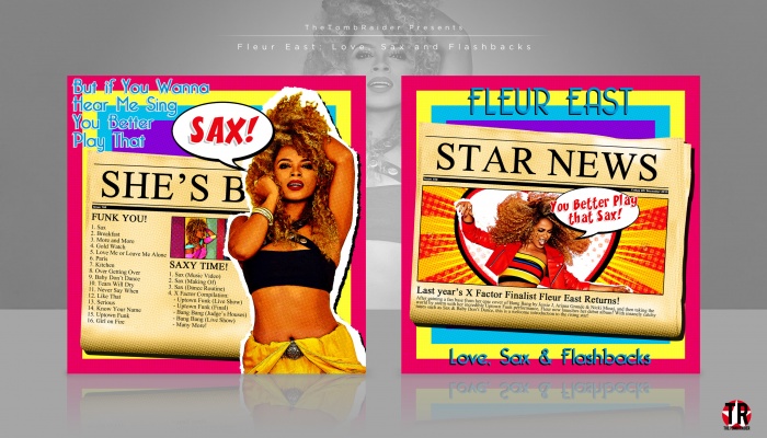
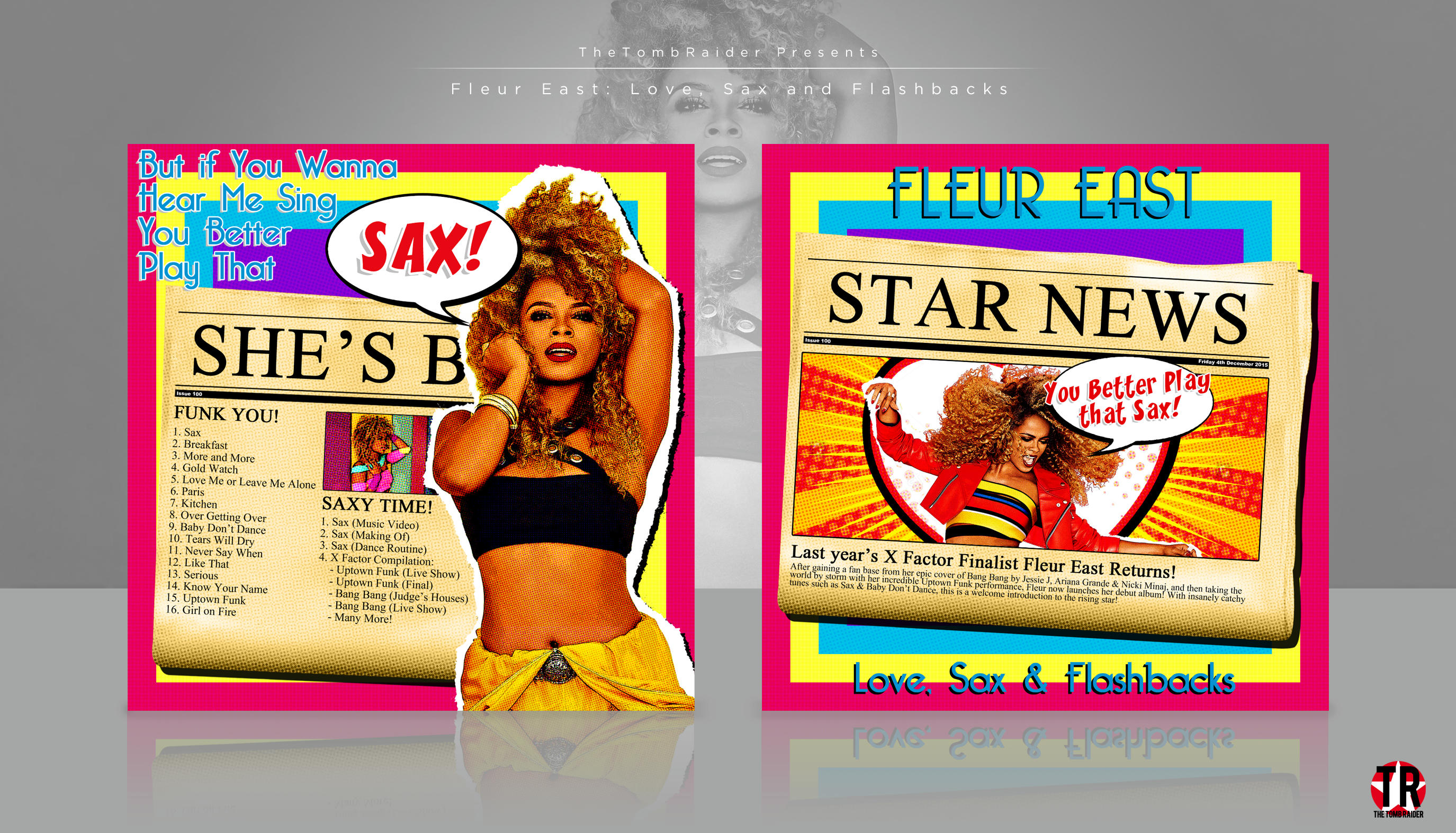
I'm guessing you mean that because of the white stroke? Yeah I did want them to look like paper, it's supposed to show her breakout since it's a debut album. Look how in depth and organised I am.
[ Reply ]
texture fire! I like.and who is it?and finally stroking the white is not needed
[ Reply ]
The white stroke is used to go with the pop art theme I have running throughout the design, so really it is needed.
[ Reply ]
if one more person criticises the white 'cutout' look i'm going to punch a goose XD
not the biggest fan of the random colour scheme, but pop art has that kind of thing, so i can't complain. keep it up and pLAY THAT SAX~
[ Reply ]
omfg what are you doing here XD
[ Reply ]