I like it, the collectors box looks great, effective minimal design with bold colours. I feel like you could've tried to make a more unique 'identity' to each of the individual games though, if you get my drift, keeping to the theme but having something different about them.
I really don't know if i'm digging this all that much, Like don't get me wrong the Collectors box looks great. I really like the simplistic illustration style with the orange and black colour scheme it complements each other really nicely and has a really cool flow. But the game covers themselves just look too...empty.
I agree with Rob they just lack personality from box to box it just feels very methodical and uninteresting, I feel like if each box had the same illustration treatment the first box had this would be outstanding but how it is I just feel like it's lacking slightly, Sorry Ben.
Your feedback means everything to me, otherwise I'd never improve! I'll definitely revise these covers with some more illustration, and potentially change the base colours of each game to match.
An orange for the first, blue for the second to match the Wrath of Cortex theme, and potentially a purple to match the crystals in number three?
I suppose I could actually try to implement the original game logos as well in alternative versions, and possibly even objects from the games such as crates, crystals, warp portals, NPC's, enemies etc.
i feel there should be one character at least behind the typography to give a more balanced design. As it stands the covers within the proposed "box" are rather uninteresting.
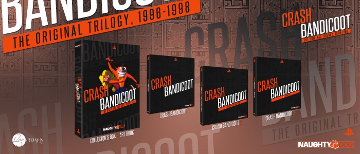
 Crash Bandicoot Collection Box Cover Comments
Woah, quite different and minimalistic vibe for a Crash cover. I dig this! Nice job, Ben! :)
[ Reply ]
I like it, the collectors box looks great, effective minimal design with bold colours. I feel like you could've tried to make a more unique 'identity' to each of the individual games though, if you get my drift, keeping to the theme but having something different about them.
[ Reply ]
^^^ This
[ Reply ]
I really don't know if i'm digging this all that much, Like don't get me wrong the Collectors box looks great. I really like the simplistic illustration style with the orange and black colour scheme it complements each other really nicely and has a really cool flow. But the game covers themselves just look too...empty.
I agree with Rob they just lack personality from box to box it just feels very methodical and uninteresting, I feel like if each box had the same illustration treatment the first box had this would be outstanding but how it is I just feel like it's lacking slightly, Sorry Ben.
[ Reply ]
You don't have to apologise :)
Your feedback means everything to me, otherwise I'd never improve! I'll definitely revise these covers with some more illustration, and potentially change the base colours of each game to match.
An orange for the first, blue for the second to match the Wrath of Cortex theme, and potentially a purple to match the crystals in number three?
I suppose I could actually try to implement the original game logos as well in alternative versions, and possibly even objects from the games such as crates, crystals, warp portals, NPC's, enemies etc.
[ Reply ]
I agree with everything which has been said, I still love your cover tho
[ Reply ]
i feel there should be one character at least behind the typography to give a more balanced design. As it stands the covers within the proposed "box" are rather uninteresting.
[ Reply ]