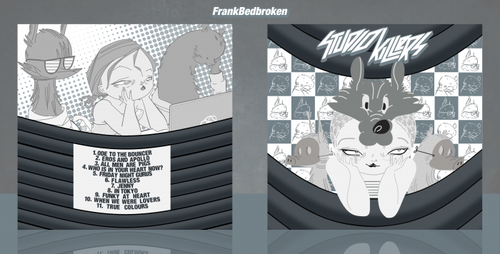
New box! It finally uploaded, holy fuck!
I've been on and off trying to do something for the Do Evn Music Comp lately, and I've finally come up with a design that I am slightly satisfied with. So, Studio Killers is basically the electronic music answer to Gorillaz, as in they are a virtual band in which we don't know who's behind it, much like Gorillaz in their first album. I just found their music to be quite fun and catchy, so I decided to go ahead and do something for it. I was also thinking in making a Savant album for this, but Savant has too much different artstyles to each album that are hard to mimick. I want to do something with Savant after this, though. Anyways, to the box! As of now, I'm not sure if the color scheme I went with works well, to be quite honest with you, also, I previously had a Studio Killers logo in the style of the Looney Tunes logo, to make the influence in it a bit more clearer, but I felt like it didn't work well enough so I just edited the official logo a bit.
Anyways, as always, constructive criticism is welcome, and huge thanks to Paper, Higashi89 and Ulquiorra for the help and the feedback on the forums. It's greatly appreciated.
Hope you guys like it! :D
 Studio Killers Cover Comments
Comment on FrankBedbroken's Studio Killers Cover.

Very nice, Frank! My only nitpick is the way the text on the back has been handled. Each line seems too close together, there should be a slightly bigger gap. The fact that each character is capitalised also contributes to this problem. But that's only minor; overall this is awesome. Great job! :)
[ Reply ]
Thanks, Nathan! Yeah, I kinda messed up on the text there, and I really couldn't come up with a better idea for the text. If I can, I'll try to fix it on the next update. :D
[ Reply ]
That front is wicked awesome
[ Reply ]
Thanks, Vince! :D
[ Reply ]
Looks awesome, I really like the old school Looney-Tunes look! good luck in the comp Frank!
[ Reply ]
Thanks, PS! :D
[ Reply ]
You're one of my favorites here Frank. And this box is great like your other works. Good luck bro . . .
[ Reply ]
Thanks, Matin! :D
[ Reply ]
I'm not so sure about the capitals and curved text on the back :/ but the overall artwork looks great ;)
[ Reply ]
Thanks, Bastart! Yeah, I wasn't either, but I really couldn't find a more creative way to arrange the text. What would you suggest?
[ Reply ]
@FrankBedbroken maybe a different kind of font (more catoony) and more spacing within the text (the wonky letters are kinda fitting though)
[ Reply ]
wolla , love this one :")
[ Reply ]
Thanks, Ali! :D
[ Reply ]