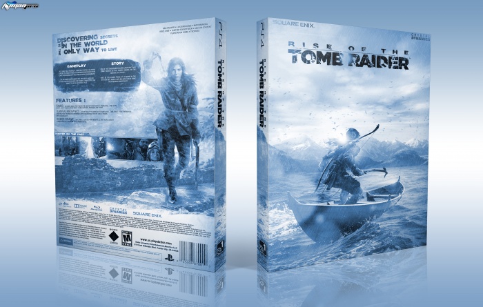
I really hard work on this one ( I used boat , sky , sea , Mountain images and many brush and light effect and more to finish it ) , thanks to devianart for logo and renders ;)
please full view and say your opinion,thanks
 Rise of the Tomb Raider Box Cover Comments
Comment on iman pro's Rise of the Tomb Raider Box Art / Cover.

Just Excellent
[ Reply ]
thank you :)
[ Reply ]
I love it, this is really awesome. Great job!
[ Reply ]
thanks dear
[ Reply ]
AWESOME! WOW! AMAZING... BRAVO
[ Reply ]
Good work Iman, love the overall "Cold/Ice" feel.
[ Reply ]
wow great cover man
[ Reply ]
why anyone didn't put printable. shit. that's nice. i want to have a printable version of that
[ Reply ]
sorry , I buy printable on my devianart profile
[ Reply ]
love the style, keep it up! :D
[ Reply ]
Looks good. Definitely one of your best. I really like the blue you chose. You're definitely getting better with organizing your content on the back.
[ Reply ]
thank sis , your comments is big help for me
[ Reply ]
Amazing!
[ Reply ]
thanks bro
[ Reply ]
Wow Very Nice :-$
[ Reply ]
thanks dear
[ Reply ]
The space between the logo and Lara is bugging me, I'd move it down quite a bit. I also would have added a second tone to the box and made the screenshots the original color, so it stands out from the rest.
[ Reply ]
thanks for comment
[ Reply ]
really awesome. Great job!
[ Reply ]
thanks man ,glad you like it
[ Reply ]
I think this is good, the front is a nice take on the game that hasn't been done yet. On the whole, I do really like it.
A couple of things are bugging me though, for example some of the lighting on the front across Lara looks more like masking errors or rough brush strokes, you should neaten those up. Also, I agree with Bastart about the empty space between the logo and Lara.
For the back, I think it's pretty solid, but I also agree with Bastart about the colouring of the screenshots; the fact that they blend in with the colours and the background makes them less noticeable, when really they should be eye-catching.
Overall though, great job Iman :)
[ Reply ]
thanks for comments nathan ,nice to see your comments again but
1.Do you know what I did on front ? what do you mean from masking errors ??? this light effect not masking errors
2.about screenshots I did it , that doesn't working , that breaking color scheme :)
[ Reply ]
@iman pro
1. I mean the lighting effects look a little rough, they look like they need touching up a little more to make them look perfect.
2. I can see they would have broken the colour scheme, but instead of completely covering them, maybe you should've tried making them darker? Or maybe desaturated them?
[ Reply ]
Bravîoo:D
[ Reply ]
thanks bro
[ Reply ]
congrats
[ Reply ]
Congrats man :)
[ Reply ]
Congratulations dude! Well deserved
[ Reply ]
thanks guys
[ Reply ]
This is amazing...I love it....is there any way to get a flat version of this? Even if there isn't, well done, it's stunning!! :)
[ Reply ]
This is my favorite rotter box all time
[ Reply ]
Thanks bro
[ Reply ]