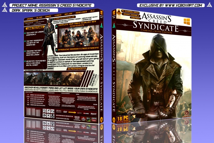
The front is quite good, I think Assassins Creed should have been bigger than Syndicate though.
The back is what brings this down imo. Although it's quite imaginative with all the holding devices and blemishes. I still find it quite boring. I think this is due to the block colours. And same font everywhere (Also pretty much the same size wirting). I feel if you made certain parts of the text bigger to show more emphasis in different parts such as headings, sub headings, tag lines compared to just body copy, which coud be smaller.
Lastely there are some spelling mistakes and why is "Dead Kings DLC" included?
 Assassin's Creed Syndicate Box Cover Comments
Hoooly shiiiit DARK SPARK ! Awesome ! ))
[ Reply ]
Thank You Dude
[ Reply ]
please Printable [email protected]
[ Reply ]
I Upload Printable Just For You
[ Reply ]
Nice Work(-;
[ Reply ]
Thank You
[ Reply ]
Nice
[ Reply ]
Thank You
[ Reply ]
Nice work.
[ Reply ]
Thanks My Friend
[ Reply ]
The front is quite good, I think Assassins Creed should have been bigger than Syndicate though.
The back is what brings this down imo. Although it's quite imaginative with all the holding devices and blemishes. I still find it quite boring. I think this is due to the block colours. And same font everywhere (Also pretty much the same size wirting). I feel if you made certain parts of the text bigger to show more emphasis in different parts such as headings, sub headings, tag lines compared to just body copy, which coud be smaller.
Lastely there are some spelling mistakes and why is "Dead Kings DLC" included?
[ Reply ]
Thank You For Comment. I Will Fix Them Later
[ Reply ]
plz Printable
[ Reply ]
Dreamy
9.5/10
[ Reply ]
Thank You Body
[ Reply ]
I Like Very much your front box
[ Reply ]
very good, I want be like you :D
[ Reply ]
Thank You Dude. tanx a lot
[ Reply ]
Amazing
[ Reply ]