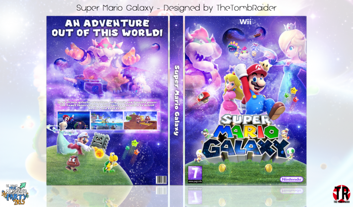
Here's my BYTD cover!
Thanks to everyone who gave feedback on this cover, it's highly appreciated!
Thanks for looking ;)
 Super Mario Galaxy Box Cover Comments
Comment on TheTombRaider's Super Mario Galaxy Box Art / Cover.

Came out great, good job!
[ Reply ]
Thanks! ^.^
[ Reply ]
Came together amazingly, seriously impressesed good job man!
[ Reply ]
Thanks, PS ^.^
[ Reply ]
Not bad , cover is busy a little because you use a lot renders , font hard to see , I think need shadow , good color you using , good luck nathan :)
[ Reply ]
I see what you mean, thanks Iman ;)
[ Reply ]
again nice work hummmmmm wow
[ Reply ]
Hummmmmmmm thanks! :)
[ Reply ]
I'm in love with this. It's seriously freaking fantastic, I just love everything about this. Amazing job, Nathan! :D
[ Reply ]
Thanks a lot, Frank, for your compliments and your help in the WIP :D
[ Reply ]
Love it man. Apart from your previous TR box. When you normally do a full page back cover I always find them to be missing something. Always looks a bit empty. I feel if you had the legal rubbish at the bottom it would always fill out the back cover more.
Aside from my own personal issue. The design is top notch. Well done
[ Reply ]
Thanks Vince ^.^
There was some legal information on this originally, but it was in the way so I deleted it, haha
[ Reply ]
I LIKE THIS ONE SO MUCH MY FRIEND
[ Reply ]
Thanks man ;)
[ Reply ]
This came out really nice. I love the effect you've used on Bowser and Rosalina, it looks amazing.
[ Reply ]
Thanks, Mat ;)
[ Reply ]
It looks like it is your best box, well done! :D
[ Reply ]
Thanks man! ^.^
[ Reply ]
Nice!
[ Reply ]
Thanks ;)
[ Reply ]
What is BYTD?
[ Reply ]
It's a group where some designers help each other produce a high quality cover
[ Reply ]
@TheTombRaider oh, alright.
[ Reply ]
This looks really great, though I think the lighting on the back is a little too bright compared to the front. Other than that, really love the composition and overall design. Great job!
[ Reply ]
Thank you! :)
The lighting is actually the same on both sides, it's Rosalina that makes it seem less bright on the front. Still, I see what you mean.
[ Reply ]
Love the blend of colors and the renders are placed perfectly..though, i feel like you should boost the saturation on the log and sharpen the render of fire mario on the back, idk...amazing box though :)
[ Reply ]
Thanks ;)
[ Reply ]
Woah you are on a hof spree at the moment congrats man!
[ Reply ]
Haha, thanks, PS! :)
[ Reply ]
This 2 or 3 in a row
[ Reply ]
Ps congrats
[ Reply ]
2 in a row, TR Underworld and now this. Thanks, Vince! :)
[ Reply ]
Wooww ! Congrats Nathan ! ;)
[ Reply ]
Thank you! :)
[ Reply ]
Congrats..!!
[ Reply ]
Thanks JR! :)
[ Reply ]
Congrats Nathan,Well deserved . . .
[ Reply ]
Thank you Matin :)
[ Reply ]
Congrats Nathan ;)
[ Reply ]
Thank you Amin :)
[ Reply ]
Very nice. Like the color scheme you got going on. Although the color scheme isn't anything new we haven't seen for these Super Mario Galaxy boxes, it is well done. FAV
[ Reply ]
Thanks man! :)
[ Reply ]
Very good, maybe add a few goombas on the planet for the front, something to fill a bit more space.
[ Reply ]
Thank you :)
[ Reply ]