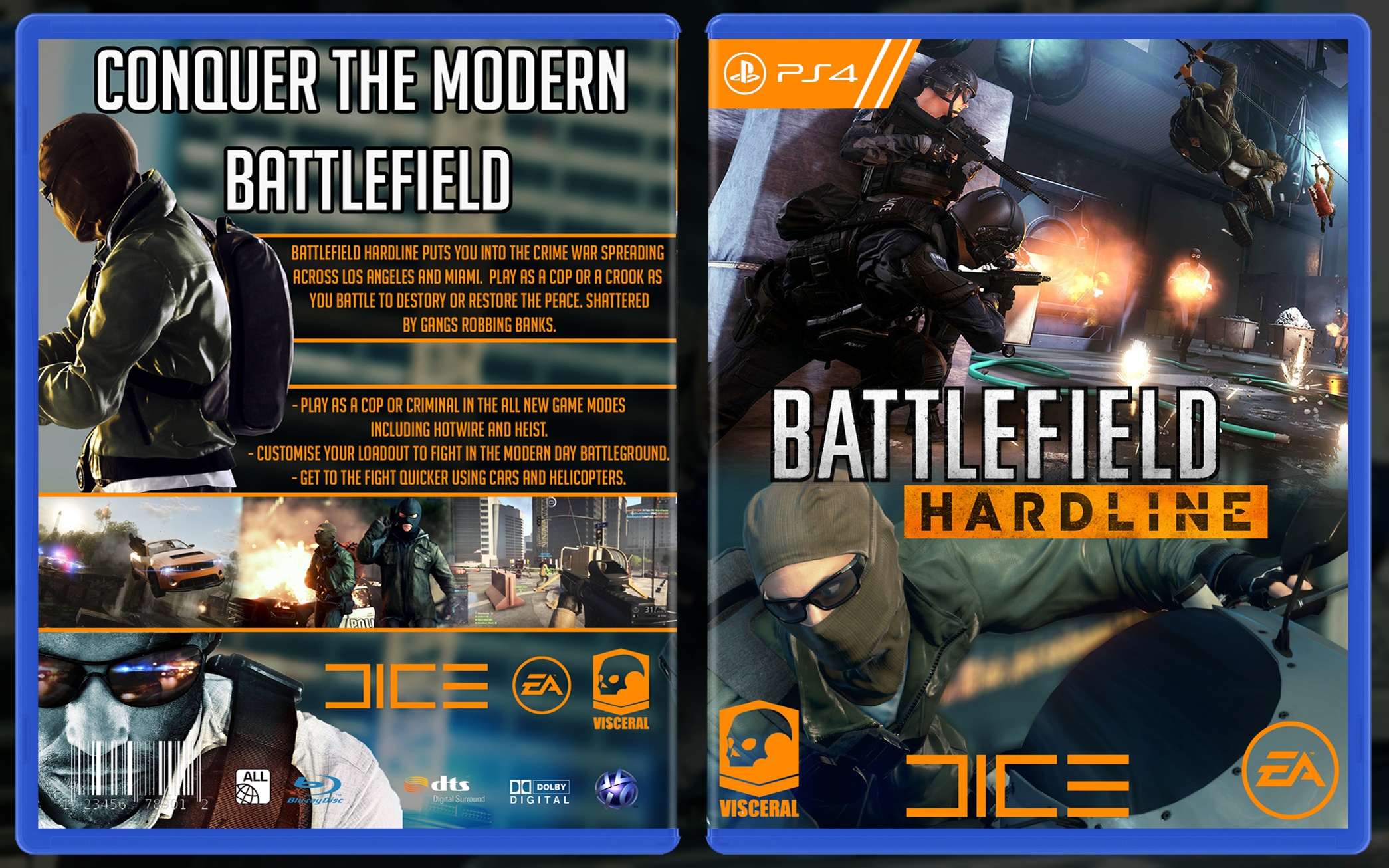
My next box and my first one on PS4.
Thanks to Vince for the awesome template - link
My Call of Duty: Ghosts case has been updated - link
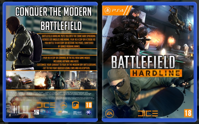
[ Box updated on March 4th, 2015 ] [ original ]
 Battlefield HardLine Box Cover Comments
Comment on AlternationHD's Battlefield HardLine Box Art / Cover.
I like the front somewhat, although it looks kinda dull (hey, much like the game itself!). My only issue with it is that the Visceral, and Dice logos are way too big, especially the latter one.
I think the back could use some better organization, as of right now, it looks kinda boring, and there's not really much connection between the front and the back, it's not bad, but it's not really eyecatching. Also, I'm not sure why did you add the guy with the glasses beneath the screenshots, I think it would be better if you just left the legal text there.
Overall, it's not bad, but it's not great either. My advice would be to post the next box you're working on on the WIP forums, so people can give you feedback on how to make your stuff better.
Sorry if I seemed way too harsh on this, it's definitely not my intention.
[ Reply ]
thanks for the tips, i generally make the logos too big out of habit. Thing do need changing :)
[ Reply ]
NICE. I LIKE THAT. THE FRONT IS DIFFERENT AND BEAUTY. BACK IS A LITTLE EMPTY BUT OVERALL IS GOOD. KEEEP IT UUUUUP MY FRIEND
[ Reply ]
Thanks :D
[ Reply ]
I agree with Frank about the ways you could improve, mainly logos too big on front. And the render of the guy below the screenshots. I think the legal text would look better there too. However your overall case is a much better design, everything is much neater and it looks like you are taking in all the feedback people have given you. So good work, keep it up.
[ Reply ]
Thanks Vince :)
[ Reply ]
Small design update, thanks for the tips!
[ Reply ]
Better!
[ Reply ]
@Vince_1990 thanks ;)
[ Reply ]
My new box updated today , front designer by me
[ Reply ]
Someone likes my case :3 - link
[ Reply ]