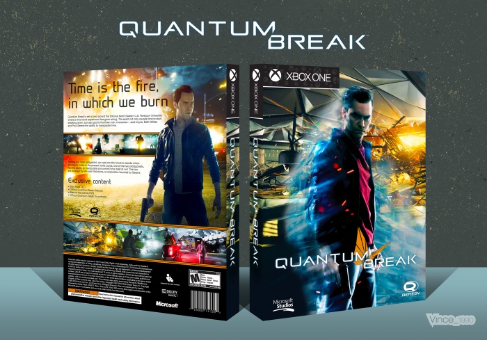
Hey everyone, so I decided to make a case for this game, it looks very fun and different... Even though I dont have a Xbox one to play it....
Anyway this is my first Xbox case. I might start making more. I had quite a lot of fun with this and the Xbox One template. I will upload it too if anyone else wants to use it.
Thanks for looking at my work, please check out my older cases if you havent already.
 Quantum Break Box Cover Comments
Comment on Vince_1990's Quantum Break Box Art / Cover.

While this does look nice, it doesn't feel as good as your usual covers.
The back is the problem. It looks rushed in my opinion. The text is too plain, it just doesn't fit the design. And I feel like the renders lighting is a little off too. The front is great though, I really like it.
[ Reply ]
Thanks Nathan I know what you mean. Its just a bit empty. I'm not so used to having that much room Seems I always do PlayStation cases Haha. also there isn't really any details about the game to fill the space. But I'm happy with it for now. Maybe when more details come out I will re make it.
[ Reply ]
I agree with TheTombRaider—the back is definitely lackluster in comparison to the front, but it's not bad. I actually like the typeface and it works well with the logo, but I feel you could have been more dynamic with the back considering the front has a lot of play with geometric shapes. You could have bought some of that to the back instead of sticking with a quite linear path with your content.
[ Reply ]
@lucidhalos Thanks for the advice man :)
[ Reply ]
Nice I love blue,orange boxes :)
And nice template dude...
[ Reply ]
Thanks man, glad you like it. it's a bit late for you now isn't it?
[ Reply ]
@Vince_1990 Totally..!!
[ Reply ]
I like the Front man. I really like the sharp contrast between the yellows and the blues and I think you should of more visibly continued that on the back which you kinda did but I'd of exaggerated that alot more i agree with the others about the render on the back, I'd personally mess about with the Contrast/Brightness until he looks similar to the front render, I think this box just lacks consistency between the two covers just make everything more contrasted with stronger colours and I think you'd be there I do find the two screenshots area a bit odd I'd change the top one to Reviews maybe? idk anyways I really like the template, I'd defiantly be interested in using that for sure!
[ Reply ]
Thanks for the tips man.
[ Reply ]
I love it, especially the front!
[ Reply ]
Cheers UV
[ Reply ]
o shit vince it's viniceeeeeeeeeeeeeee.
[ Reply ]
Haha tanks Ajay
[ Reply ]
VERY NICE DESIGN. GOOD JOB. THIS COVER DESERVE HOF
[ Reply ]
Cheers HB
[ Reply ]
Good front, simple back. In general, the balance of the sides.As a first experience with xbox template - very good).
[ Reply ]
Thanks Dante :D
[ Reply ]
I have to agree with TombRaider. The render on the back doesn't feel right, the colors and dimensions look weird. While I love the colors and the overall concept, the execution is not as good as usual, Vince!
[ Reply ]
Cheers for the advice jakob
[ Reply ]
Another amazing job.Love it.
[ Reply ]
Thanks man
[ Reply ]
I really like the style of this case, especially the front its really eye catching. Maybe make the text on the back a bit bigger to fill in the empty space. good work :)
[ Reply ]
Eh I'm not overly fussed. Might do a remake of it when more details is out about the game
[ Reply ]
I Love It :)
[ Reply ]
Thanks Leon. Long time
[ Reply ]
nice
[ Reply ]
Thanks Ed :)
[ Reply ]
Congrats Vince! :)
[ Reply ]
Thanks Nathan
[ Reply ]
congrats Vince (:
[ Reply ]
Thanks JR :)
[ Reply ]
@Vince_1990 yayyyy!!!......ugh.
[ Reply ]
@AnaRchyxV2x lol thanks dude
[ Reply ]
Congrats Vince :P
[ Reply ]
Cheers Ryry
[ Reply ]
Congrats Vin . . .
[ Reply ]
Thanks Matin
[ Reply ]