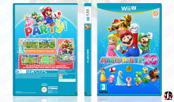
Hey!
Here's my new cover: 'Mario Party 10'.
It took around 6 hours to complete.
I'm very happy with the outcome, I personally think this is one of my best covers.
A MASSIVE thanks goes to FrankBedbroken for the help in the WIPs, your feedback is always highly appreciated!
Please leave any constructive criticism you might have!
Thanks for looking ^.^
 Mario Party 10 Box Cover Comments
Comment on TheTombRaider's Mario Party 10 Box Art / Cover.
Really nice job, as always.
[ Reply ]
Thanks Frank, thanks for your help in the WIP too! ^.^
[ Reply ]
A perfect design I really like Nathan, the best we saw so far ;)
[ Reply ]
Thanks so much! ^.^
[ Reply ]
The front is kind of "meh". I mean, it's not as festive as it should be imo, but the box is good. Also, what's that on the down right corner of the back which is also on the down left corner of the spine? Also, why didn't you use the official logo on the spine? It would be great there!
Now look, these are only critiques. I'm not telling you to go your way and update it. It's just things that you can remember before posting. And to be honesti, it's a really good box. I like the "It's time to Party" tagline on the back, and the back in general is the best part of the box art imo.
[ Reply ]
Thanks Higashi!
I agree that the back is better than the front too.
I so nearly did put the logo on the spine, but I decided against it.
Oh, the green triangle? That's the region triangle, it's on all Wii U covers (for the UK anyway)
[ Reply ]
Nice ;)
[ Reply ]
Thank you Amin! ;)
[ Reply ]
nice. would have included the "Nintendo" developer logo in the lower right corner on the front, but apart from that excellent! nice and minimal.
[ Reply ]
Omg, I always forget the Nintendo logo. Like, all the time, haha.
Thanks!! ^.^
[ Reply ]
I agree with Higashi.
[ Reply ]
Ok, thanks Martin! ;)
[ Reply ]
I really love how fun the back is and wish some of that was applied to the front. I don't think the logo is necessary on the spine, however if you wanted it to be a little more authentic a trademark (â„¢) should be applied after "Mario Party".
As Higashi pointed out, the front isn't as strong as the back but it definitely isn't bad. I do like it, but would have loved if more color was bought to the front.
Overall though, this turned out really great.
[ Reply ]
I can definitely see what you mean, thank you Lucid!
[ Reply ]
Great Job Nathan, Especially Back . . .
[ Reply ]
Thanks Matin!
[ Reply ]
I really like it! It's colorful :D
[ Reply ]
Thanks!! ^.^
[ Reply ]
And that's how it's done
[ Reply ]
Damn right
[ Reply ]
Nice ;)
[ Reply ]
Thanks ;)
[ Reply ]
I like the overall feel bit I think if you spent more time on this you could have made it much better
[ Reply ]
Yeah, I know what you mean, Vince.
I think the front could use some more work (I'm guessing you meant the front too in particular?)
Thanks ^.^
[ Reply ]
@TheTombRaider yea the bottom of the front mainly. The back I think might look better if the screenshots etc display went to the edge and spine
[ Reply ]
@Vince_1990 Ok, thanks for the feedback ;)
[ Reply ]