Hey everyone.
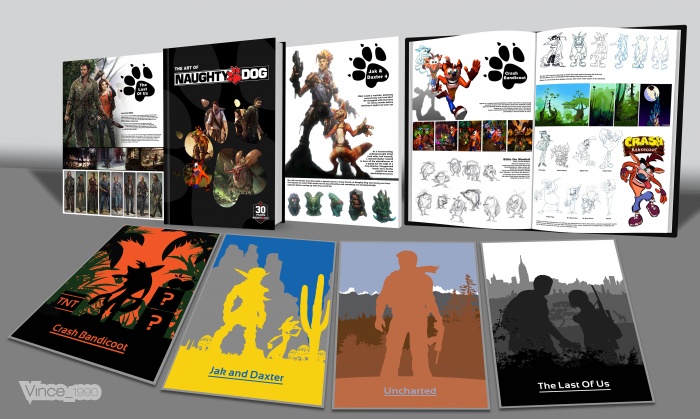
I have been working on this for a long time, since I got the book. I wanted to say if there is any low res pics thats probably because a higher res one doesnt exist.
I think this has turned out pretty well, Im happy with the design of the book but I prefer my simple posters to go with it... I hope you all like it, please leave comments and feedback.
Thanks for checking out my work :)
 The Art Of Naughty Dog Cover Comments
Comment on Vince_1990's The Art Of Naughty Dog Cover.

This looks really nice Vince!
the books at the front remind me of my Tomb Raider 2 cover ^.^
[ Reply ]
Thanks Nathan :)
I do love that TR 2 cover you made.
[ Reply ]
Thanks ;)
[ Reply ]
Nice ;)
[ Reply ]
Thanks you man :)
[ Reply ]
Oh my lord , this is ....... GREAT GREAT GREAT
[ Reply ]
Haha thanks Iman, I thought you would like it.
[ Reply ]
Nice Work Dude...
I Love It...!
[ Reply ]
thanks JR, thanks for your help too!!
[ Reply ]
I like it, although I would've liked to see some sort of texture on the posters there, more specifically on the Jak and Daxter and Uncharted ones, and I think another font would've been better, as the one you have now looks a bit lame IMO. Still, everything else is cool. Good job! :)
[ Reply ]
Thanks Frank! Yea I know what you mean... I wasnt sure if I should even put the names of the games on the posters and because they are very simple I didnt want to out their logos on it. So I just ended up using PlayStations font.
[ Reply ]
^
[ Reply ]
@Martiniii332 Thanks ^
[ Reply ]
I love this but I agree with the font, honestly would prefer a simplified versions of the logos or none at all, but everything else is great.
[ Reply ]
Those covers would have looked better if they weren't silhouettes.
[ Reply ]
They are poster I made for my wall. I wanted something different so that's why they are silhouettes and block colour
[ Reply ]
@Vince_1990 That's exactly why I don't like it, silhouettes are so overdone it hurts.
[ Reply ]
@spypilot
True, but most people use them and they look like absolute shit. But, Vince's use of silhouettes look really great here, so I don't see the problem.
[ Reply ]
@TheTombRaider its just generic is all, i didn't fav your TR2 box for the exact same reason.
[ Reply ]
@spypilot the main part of this isn't the posters anyway it's the book. Like I said I personally wanted posters like that for my wall at home.
[ Reply ]
Very good design, I really like Vince
excellent work ;)
[ Reply ]
thanks Bro :)
[ Reply ]
Nice Work Vincent.
[ Reply ]
Thanks man glad you like it
[ Reply ]
This looks really great. I really like simple covers, but the text definitely take away from the design. Maybe it would have worked better without the underline and a different font face?
[ Reply ]
Thanks lucid
[ Reply ]
This ended up great vince ;)
[ Reply ]
Cheers bro
[ Reply ]
I love it
[ Reply ]
Hey Vince, can you send me a copy of your posters?
[ Reply ]
I will have a look when I'm ok my computer man :)
[ Reply ]
Thanks :)
[ Reply ]
congrats bro ;)
[ Reply ]
Congrats Vin, very well deserved . . .
[ Reply ]
congrats :)
[ Reply ]
Congrats Vince!
[ Reply ]
Oooo unexpected, thanks all for the support :)
[ Reply ]