New box!
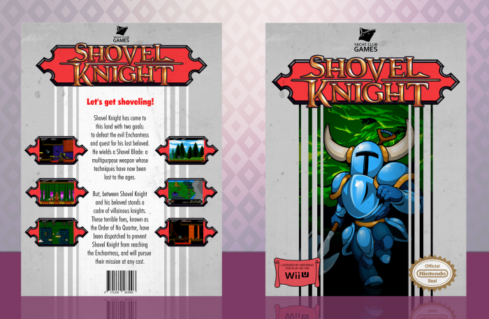
Shovel Knight was easily one of the best games of 2014 in my opinion, and since it felt so much like an old NES game, I decided to make a box for it in the style of Konami's old NES covers. I have to say, I'm not really satisfied with the final result, it just seems strangely empty to me, and I might have gone too far with the grungy look. :/
As always, constructive criticism is welcome and huge thanks to JoeyTheHedgehog and lucidhalos for the help and feedback, it's really appreciated. Also, thanks to Spiderpig24 for the Wii U logo.
Hope you like it! :D
 Shovel Knight Box Cover Comments
Comment on FrankBedbroken's Shovel Knight Box Art / Cover.

wow , Very Nice Brother ;)
[ Reply ]
Thanks, Amin! :D
[ Reply ]
Great work Frank. Looks very retro
[ Reply ]
Thanks, Vince! :D
[ Reply ]
I've gotten a bit bored of new 8-bit games lately, so I have no interest in the game or so, but this really fulfills that vision, and it looks great. Well done!
[ Reply ]
Thanks, oxol! Yeah, the market's being somewhat oversaturated on retro throwbacks recently, but this one actually stands out in just being amazing, but I can see where you're coming from. :D
[ Reply ]
You keep posting these high-quality boxes. It's nice to watch your constant output.
[ Reply ]
Thanks, Jakob! :D Although, I don't think my stuff is really "high quality". :/
[ Reply ]
You keep improving with every box, this is great!
[ Reply ]
Thanks, Nathan! :D But, I'm not sure if I'm improving on my stuff, I think that's normally in an average level most of the time. :/
[ Reply ]
@FrankBedbroken
No, you're one of the best designers this website has to show in my opinion :)
[ Reply ]
@TheTombRaider I would quite like to disagree. Martiniii332, alldreamsfalldown, shirazihaa, Drakxxx, Hazzy25, aldimon, lucidhalos, Magical, TwistedTinkerToy, Higashi89, yourself and many more, are by far, better designers than me, and some of the best designers this website has homed.
[ Reply ]
Steel Thy Shovel!
[ Reply ]
You are naught but a decadent dandy!
[ Reply ]
Yeeesss
[ Reply ]
Thaaanksss
[ Reply ]
Frank, your designs whenever I like more. It shows as you progress. I think the front is very nice, I like the effect of the logo and the background is perfect. It has that air Templar, the medieval era, combined with the game he is pretty phenomenal. I do not see either as a simple design, I see it as an incredible design . .
Frank really like this design and every day you surprise me more friend. keep it up!! ^.^
[ Reply ]
Thanks, Warsony! :D
[ Reply ]
Though they fit, i think the screenshots are too small. Nevertheless, good job!
[ Reply ]
Thanks, dude! Yeah, I tried to make them bigger but the screenborders were just too big and collided with the edges, so I couldn't make it. :D
[ Reply ]
I just started playing this game & I'm just reviewing memories one after another , great choice of designing for this game and also a neat Design ,, :")
[ Reply ]
Thanks, Ali! :D
[ Reply ]
Nice job man! You definitley nailed the classic look
[ Reply ]
Thanks, Joey! :D
[ Reply ]
Congrats ;)
[ Reply ]
Thanks, Amin! :D
[ Reply ]
Congrats Frank, Well Deserved . . .
[ Reply ]
Thanks, Matin! :D
[ Reply ]
I actually wasn't expecting this one to get HoF! Thanks everyone for the favs and comments! :D
[ Reply ]
Well it's about time this got HoF, congrats Frank!
[ Reply ]
Thanks, Nathan! :D
[ Reply ]
Congrats frank. More of your cases need HOF!
[ Reply ]
Thanks, Vince! Although, I think I have enough HoF's already. :D
[ Reply ]
Congrats FranK :)
[ Reply ]
Thanks, JR! :D
[ Reply ]