![]() »
»
Merry Christmas guys :D
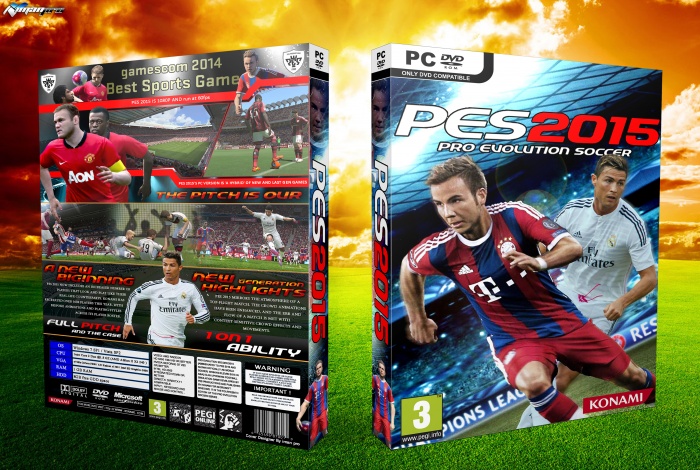
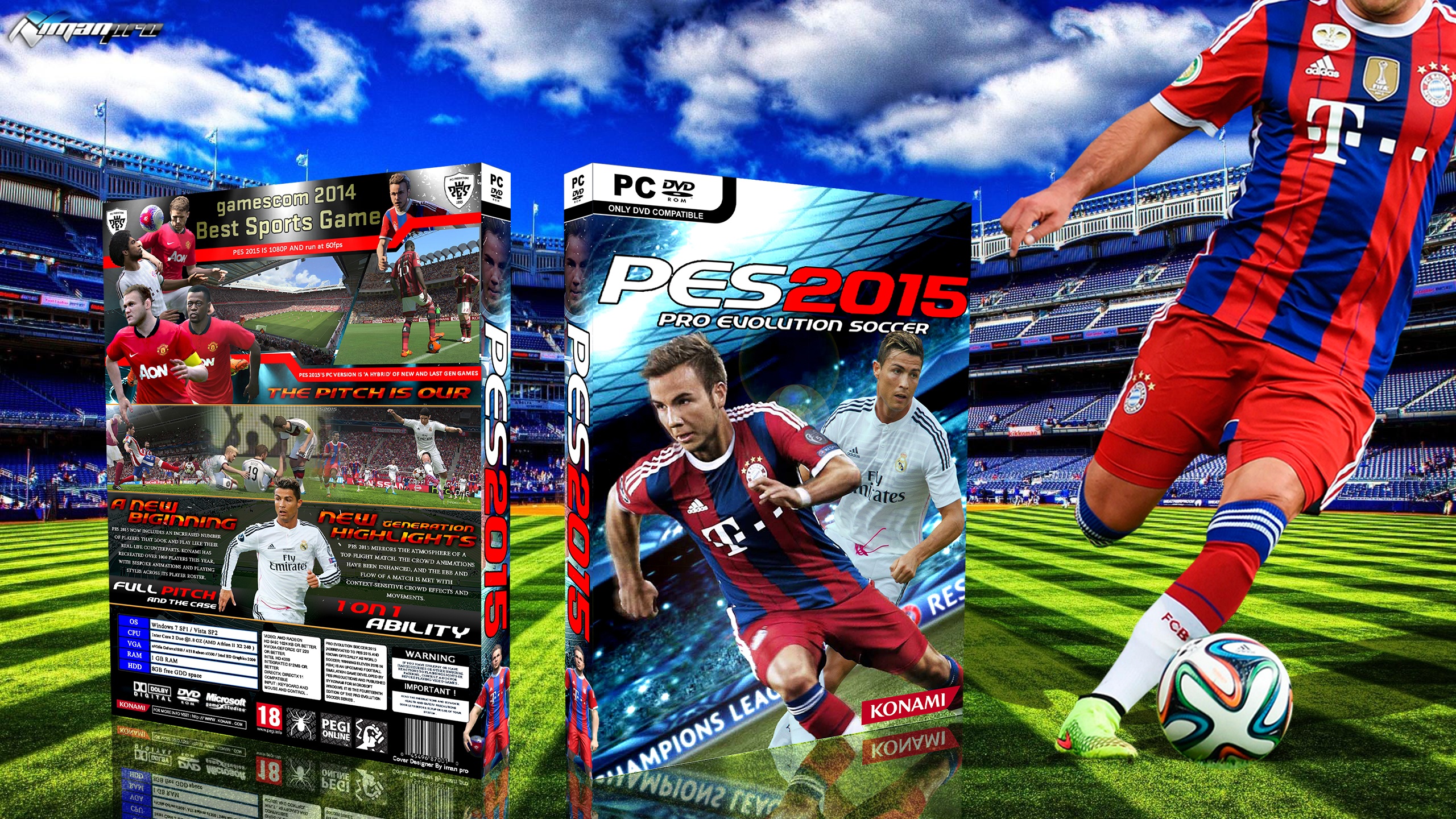
A Old Cover That I Finish It Today :)
Please see FIFA AND PES 2015 renders : link
[ Box updated on May 26th, 2015 ] [ original ]
 PES 2015 Box Cover Comments
Comment on iman pro's PES 2015 Box Art / Cover.
its so nice ♥
[ Reply ]
Thanks :D ♥
[ Reply ]
not good , style font very bad
[ Reply ]
Not bad, I'm not really a fan of the back. I quite like the front though :)
[ Reply ]
I think this is a professional cover
[ Reply ]
Thanks man :D
[ Reply ]
I like the blue and white background on the front but I'm not a fan of the renders used over it. Maybe it's just the angle they are at... The back I prefer however I think it has too many renders. Maybe get rid of one or two and make the other renders bigger
[ Reply ]
Despite the weird font for the paragraphs on the back, an intense age rating (:D), the cramped spine and the lack of an age rating label on the front, the back is fantastic and the front is well-adapted and inspired from the original.
Although not your best, a nice box art nevertheless :D.
[ Reply ]
Yeah , thanks for feedback my friend
[ Reply ]
@iman pro ;) My pleasure! It's about time I said something about your work :D.
[ Reply ]
@McKane I change it soon , thanks
[ Reply ]
@iman pro good disign.Very nice,(midooni chiye hade aghal wallpaper nandakhti ta like chizi bokhore)gerefti manzooram az chiziro ke ...contineu
[ Reply ]
@LOoOP you're welcome , thanks
[ Reply ]
Sup man, check your Gmail. I just sent you that PDF
[ Reply ]
nice
[ Reply ]