it's done. BIG FAT credit to Hellknight for his brand new temp, and a lot of help with the box. i believe this just might be one of my best, but i couldn't of done it without Hellknight. Thanks man!
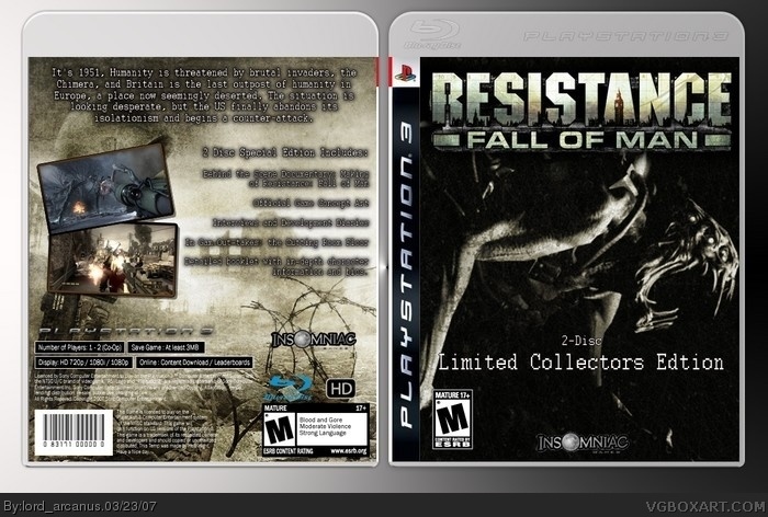
Back info is slightly wrong, the game only goes up to 720p, theres no 1080i or 1080p.
But anyway, it's good. Where'd you get the front picutre from?
Back text is a little blurry, but I'm going to assume that is because of on-site compression, it's happened to me before.
4.5/5
#10, have you still got the layers version? If you do, re-do the back text. Put it in a bolder font.
The front logo is not cut out fully, but I'll easily forgive that as it's a pain. Instead, what you could do is go around and use a darken or a burn tool too darken the edges so that the beige parts aren't noticable.
The insomniac logo is also not fully cut, like before just go around the edges with a burn or a darken tool.
 Resistance: Fall of Man Collectors Edition Box Cover Comments
it's done. BIG FAT credit to Hellknight for his brand new temp, and a lot of help with the box. i believe this just might be one of my best, but i couldn't of done it without Hellknight. Thanks man!
[ Reply ]
oops, misspelled a few things. i can't change it now, but who cares?
[ Reply ]
Really good but the Collector's Edition text looks cheap. Make a good one here link
[ Reply ]
I don't like the text but everthing else is good .
[ Reply ]
i luv the cover...it's scary
[ Reply ]
whaddya know, only 5 comments, 2 of which were mine. this is like my best box art.
[ Reply ]
I like it alot. its a bummer that you mis-spelled "Edition". But so what, its nice
[ Reply ]
can someone give me a link to HK's new temp?
[ Reply ]
Back info is slightly wrong, the game only goes up to 720p, theres no 1080i or 1080p.
But anyway, it's good. Where'd you get the front picutre from?
Back text is a little blurry, but I'm going to assume that is because of on-site compression, it's happened to me before.
4.5/5
[ Reply ]
#9 it's the compression, yes. look in full view, it's better.
i didn't know about the 720p, i don't have the game or PS3 itself. thanks.
what should i improve?
[ Reply ]
#10, have you still got the layers version? If you do, re-do the back text. Put it in a bolder font.
The front logo is not cut out fully, but I'll easily forgive that as it's a pain. Instead, what you could do is go around and use a darken or a burn tool too darken the edges so that the beige parts aren't noticable.
The insomniac logo is also not fully cut, like before just go around the edges with a burn or a darken tool.
[ Reply ]
Oh, also by the way the game supports 1-2 player co-op but 1-4 player offline multiplayer.
[ Reply ]
#5, you're scary, bitch. This is great. 5/5. Great job, my Lord.
[ Reply ]