The box looks quite good, but again, text is hard to read. Oh and yeah someone gave this a 1/5...sucks huh.
Please stop saying your going to quit. Its getting annoying. I've heard you say that several times yet your still here...makes you wonder doesnt it.
I dont always get like 20 comments or several high ratings. Most of my good boxes dont have the rating they deserve or the amount of comments I would expect. But thats life so deal with it.
 Final Fantasy XII Box Cover Comments
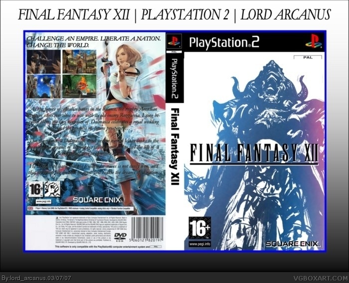
Nice one! But the back text isn´t very readable. And w00t, first comment!
[ Reply ]
It's good except the text on the back should be made white if you don't know how to use drop shadows effectively.
[ Reply ]
well, it's finally finished. credit to the electric general for his awesome help, thanks a lot man.
well i will change the text to white, it looked good on my computer but not on the site.
look in full view please.
[ Reply ]
#2, * the caption is fine though.
[ Reply ]
alright, who gave this a 2???!!!!??!!?
[ Reply ]
I reccomend taking away the spine (They dont look good with this kind of temp but other then that 4.5
[ Reply ]
Good job, but as said before, it's almost impossible to read the back text.
[ Reply ]
did you even look in full view?
[ Reply ]
I can the text better in full view . Good job 4/5.
[ Reply ]
look, only 9 fucken comments! i make a box, the nest day it has disspeared because no one fucking cares!!
I QUIT!
[ Reply ]
The box looks quite good, but again, text is hard to read. Oh and yeah someone gave this a 1/5...sucks huh.
Please stop saying your going to quit. Its getting annoying. I've heard you say that several times yet your still here...makes you wonder doesnt it.
I dont always get like 20 comments or several high ratings. Most of my good boxes dont have the rating they deserve or the amount of comments I would expect. But thats life so deal with it.
[ Reply ]